
“Logo design Exeter locals notice, remember, and love.”
That’s been my goal since relocating to Devon. I want the work I do with brands to have a real impact, and add to the personality of the city.
But delivery is a long way from the brief so, how do I get there?
Logo design is a part of how we build a visual identity.
It’s not the whole thing, but to me and my process it’s the anchor point.
After approval of a logo design, I often refer back to it for the visual next steps:
- How it works with typography?
- What colours does it evoke?
- Are there design cues for the wider visual identity?
I’m often asked about process and how I approach logo design and visual identity. Sounds like a good subject for a post, so here it is…
My approach to logo design
To me the logo is the foundation of a great visual identity and essential to how clients own their space in the market. It should take up a large part of a visual identity projects time.
While every project is different (and I pride myself on being flexible) I can’t deny that there is a way I like to approach logo design.
I feel it should be simple, modern, and rooted in strong geometry. To me good geometry pleases the eye and is a great foundation for something recognisable across digital platforms and in the real world.
The below example for AW Psychology is an example – you can see more about how it’s constructed on the project page.
![]()
Free Flow
Sometimes the stuff your mind absorbs on a client call, is different to the notes you make. I’ve talked about this before in my “How to get creative in 15 minutes” article.
I often find that I note down firm details around costs, deadlines, keywords, market positions – “project tangibles” I call them – but there are many intangible elements I’ll absorb that I don’t write down.
So, after every kick off call / meeting I give myself 15 – 30 minutes with pencil and paper in my Exeter design studio space (or wherever I am). I push my notes aside and from memory explore how I feel about the brand or project – to me these are “intangibles”.
- How does the project feel?
- Is my first impression smooth shapes, or squared shapes?
- Does it feel like organic flowing lines, or structured geometric forms?
- Is there an animal, plant, or place it makes me think of?
This is about speed of ideas rather than detail and depth. When I’m done I circle anything that feels right, file them away and return at the start of concept development.
Research
The next more “formal” step of any project for me is research. This can be a look at the market and competitors, or a deep dive into any current brand identity materials. The goal is to find inspiration / direction from what’s already out there.
A great recent example took me to Exeter Library. I start with a trawl through books on mid-century furniture design to find shapes influenced by the client’s interior decor and, after a chat with the staff, end up in the basement looking through design magazine retrospectives from 1955-1977.
Honestly your local library is a gold mine – and it’s free. Make the most of it.
Sketch Logo Design Concepts
Where the brief and research meet.
The best logos are built on great ideas. To me it’s important to visualise the ideas with pencil and paper first.
Some designers like silence. Some like to shut the world out with headphones and music. Weirdly I like silence, or I tuck myself away in the corner of a coffee shop and get carried by the buzz of the room.
I see this part of the process as a parallel to songwriting (it’s something I also do – this is me). So many songs sound amazing with a full band, but truly great ones sound just as good with one voice and a piano.
The aim of this stage is to uncover a seed of an idea. I blend forms and shapes, splice references, and explore the connections between what I’ve seen so far.
A recent example is a visual identity development project for a jewellery brand. I explored where beauty, modernism, precision and luxury meet.
The solution came from a sketch of a flower reimagined as a precision cut stone. Once the project is live I’ll post the link and sketch here to share.
Present Designs
When I’m happy with a selection of ideas (usually I shoot for three), I take it into the digital space and tidy it up. This isn’t the final design, but gives a good indication to the client of what the idea it is.
A really useful part of this processes is when I pull together a presentation with my design rationale / explanations of each concept. Sometimes as I write these I notice new elements of a concept I haven’t noticed yet.
I usually present on a call or in person to talk through my thoughts with the client and see their reaction. At the end I supply the presentation and notes for them to consider.
The goal is to land on a concept to take forward into the next stage.
Iterate the Logo Design
This is where I explore the chosen concept and almost break it.
Thicker lines. Thinner lines. Softer. More corners. As graphic design great Aaron Draplin says: “vectors are free”.
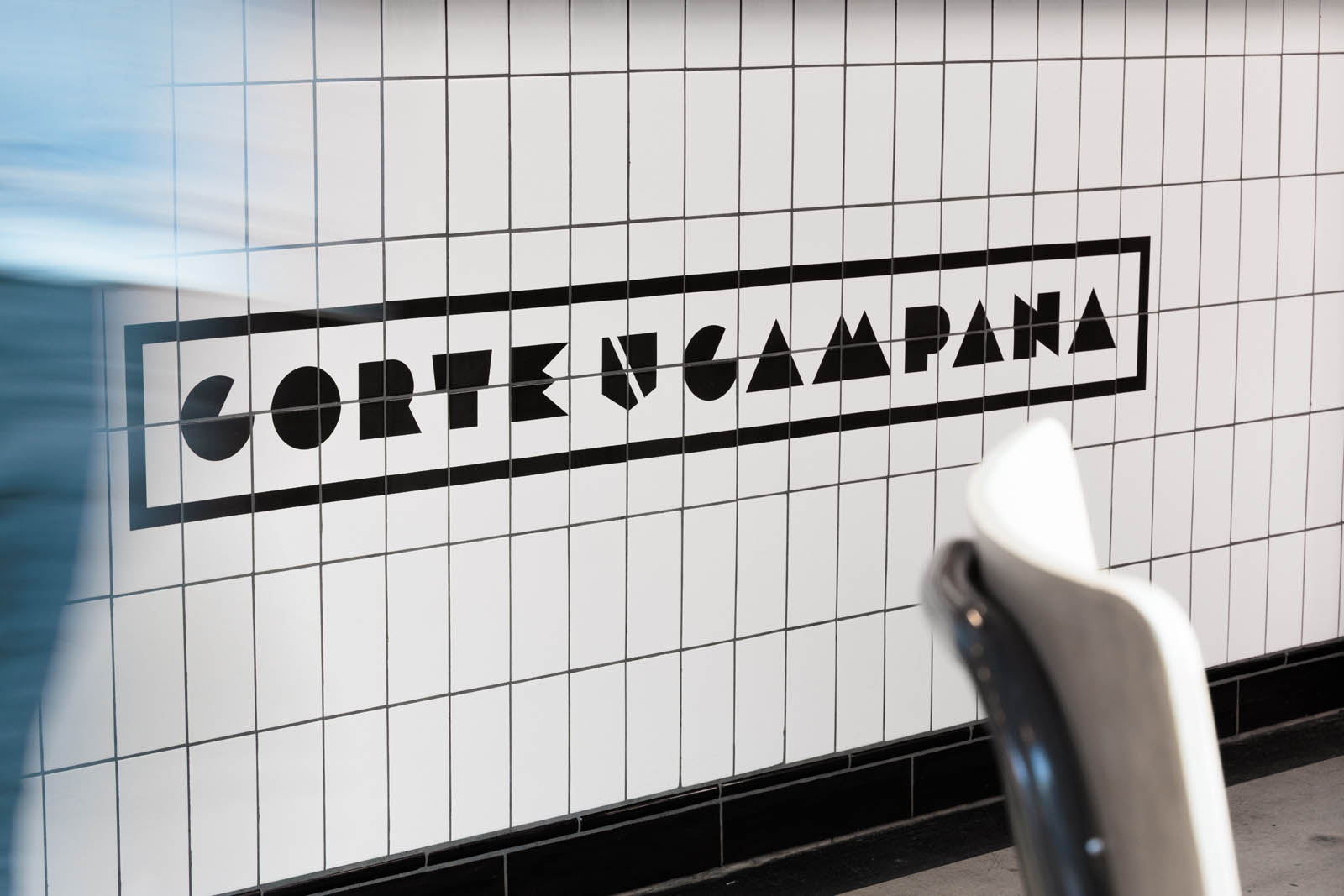
By the end of a recent project we had amassed about 50 alternatives and variations of a type-based logo design. If sketching design concepts lays out the broad strokes of a piece of logo design; this iteration stage is about the finer details and the best execution of the idea.
Sometimes it takes longer than the any of the other stages, but to me it’s where we squeeze the extra 10% out of the work.
“Logo design Exeter businesses believe in” – Summary
So there you have it. These are the steps I use to deliver logo design Exeter locals (and customers across the UK) notice, remember and love.
I’ve used them on projects for clients in business development, hospitality, education, and psychology, in Devon, the midlands and beyond. That said I’m always adding new tweaks and pieces to the process to improve and keep it fresh.
If you have a logo design project, visual identity needs, or anything that needs a graphic design spark get in touch.


