
I’ve worked with business across the UK on new logo design, redesign, and visual identity projects for over ten years. In this time it’s become clear that different graphic designers and design agencies often supply different files at the end of a project.
This isn’t necessarily wrong, and I’m not here to call folks out. What I will say is that: when you know the files you need it’s really helpful to tell the designer in the briefing stage.
Because when you receive these different files at the end of a project it saves time in future. When a designer / sign writer / advertising outlet asks for your logo in SVG, you know what it is, why they need it, and you have it to hand in your archive 🙂
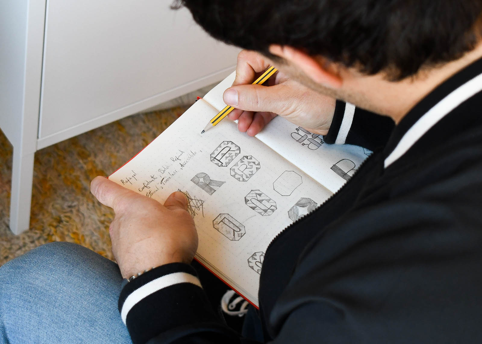
New logo design files
Having the right file type for the right job is an essential ingredient in a consistent, professional visual identity. There are two sides to the logo file family: vectors and rasters. So, what’s the difference?Raster
There are two really important file types JPG and PNG. JPGs are best for photographs, where PNGs are more suited to graphics and support a transparent background – something JPGs do not. Both can be supplied at a range of resolutions to suit different print and digital situations. I often opt for 72ppi, 150ppi and 300pi to give clients a range of size options because they do lose quality at larger sizes. Also worth noting is that these raster files often offer the best compatibility across platforms and applications like Instagram, or website content management systems.Vector
Vector files usually come in the form of EPS or SVG. These files can be upscaled to bigger sizes without loss of quality. They are perfect for vehicle livery, signage, large installations, or any application where you are displaying a logo at a bigger size.What files do I need for a new logo design?
You’ll definitely want to ask your graphic designer for- PNGs for digital applications,
- EPS for physical print work like embroidery or signage, and
- SVG for digital scalable work on websites and videos.
Typography guidance / files
Typography is often the most subtle and effective tool in a brand identity arsenal. And with a new logo design / refresh project it seems like a good time to review typefaces. Once a project is complete you’ll need the font files for your machine(s) and the appropriate licence(s) for how you want to use them. An example from my portfolio is Exeter coffee shop Alma. When their new logo design was agreed, we looked for typefaces to tell the brand story alongside the logo. We opted for Forma from DJR – really elegant, simple and in tune with Alma’s mid-century aesthetic. As part of file delivery I supplied the licence and the .OFT file for the team to use in house on their machines. If they wanted to use the typeface for their website it would need an additional licence and a WOFF / WOFF2 file for each font used.What font files do I need for my brand?
- OFT / TTF for design top / print use.
- WOFF / WOFF2 for website and digital use.
Colour codes
Technically not files themselves, but they are essential information for your brand’s visual identity. There are between three / four colour codes you should come away with in your brand identity documents… (Note: we won’t go into colour gamuts here, but if you want to geek out on colour gamuts there’s plenty of info online.)CMYK
Anything print related is usually based of the four colour system of cyan, magenta, yellow and black (CMYK) – the K is for “Key” which is how black is referred to in this system. The process uses these four inks to produce a full range of colours. So you are going to want these colour codes to maximise consistency across print / physical production. That said there is always a chance of slight variation as different printers / papers / inks in different combinations produce different results. If you want things to be super consistent you’ll want Pantone colour references.Pantone
Pantone is a standardised system for colour reproduction that can produce more faithful results in print. Additionally if you only want to use two colours in a print / physical production project, it makes sense to use two Pantones rather than CMYK. With greater precision there is usually a slight increase in cost compared to CMYK. For this reason I tend to supply the Pantone for the lead brand identity colour, unless the client requests otherwise.RGB
This is the colour system used in the digital world: red, green, and blue. The codes determine how much of each colour of light is used in producing a colour on-screen. Because anything printed reflects light, whereas digital colours are made of light, the range of colours and how they appear can vary. So keep in mind that RGB and CMYK colours will often look different side by side, and the same RGB code can produce different colours on different screens.HEX / WEB
These hexadecimal colour codes are used for website development. The colour range is the same as RGB, but it’s a more compact way of communicating the information. So not necessarily “essential” when you have the RGB colour code, but saves your web designer a job 🙂What colour codes do I need from a graphic designer for my visual identity?
- Pantone: at least for the primary colour of your visual identity to ensure consistent reproduction in print.
- CMYK: for all your primary and secondary colours.
- RBG: for all things digital like motion graphics, video titles, graphics.
- HEX: for your website team.
Copy and paste this to your designer
When you brief in (and when you approve) a new logo design / brand identity project, it’s helpful to outline the materials you definitely need at the end if you haven’t covered them already:- All new logo design lockups as SVG, EPS and PNG (72ppi and 300ppi) files.
- Brand colours as CMYK, RGB and HEX codes, with a Pantone reference for the primary brand colour.
- Typefaces supplied as OFT files for in office use and WOFF / WOFF2 files for web use, with licences supplied for agreed usage.


