
What is inclusive design? It’s is good design.
- Inclusive design is about making a piece of work as useful as possible to the widest audience.
- It considers visual decisions around typeface, sizing and colour contrast.
- Unseen elements like tags, alt text, titles, reading order are essential and should be considered at the start.
The idea of inclusive design hasn’t changed what good design is. It’s added an additional layer to the work of a designer. A hidden layer in digital documents that some don’t realise is there, but for many it actually makes a piece of design functional.
I’ve covered some simple visual examples of best practice in: 5 DIY Design Tips For Your Next Document. This time I’m going to go a little more in-depth, and below the surface of the visual, to give some concrete elements and give you an answer “what is inclusive design?”.
Visually inclusive design
These are visible elements that should be considered early on on the design process.
Type Choice
Let’s start with one of the most important decisions. The RNIB Clear Print Guidance and their Top Tips Guide For Accessible Printed Information and Communication are great for deciding type size, use of upper and lower case, and line spacing, but they don’t go into great depth about the typeface choice itself.
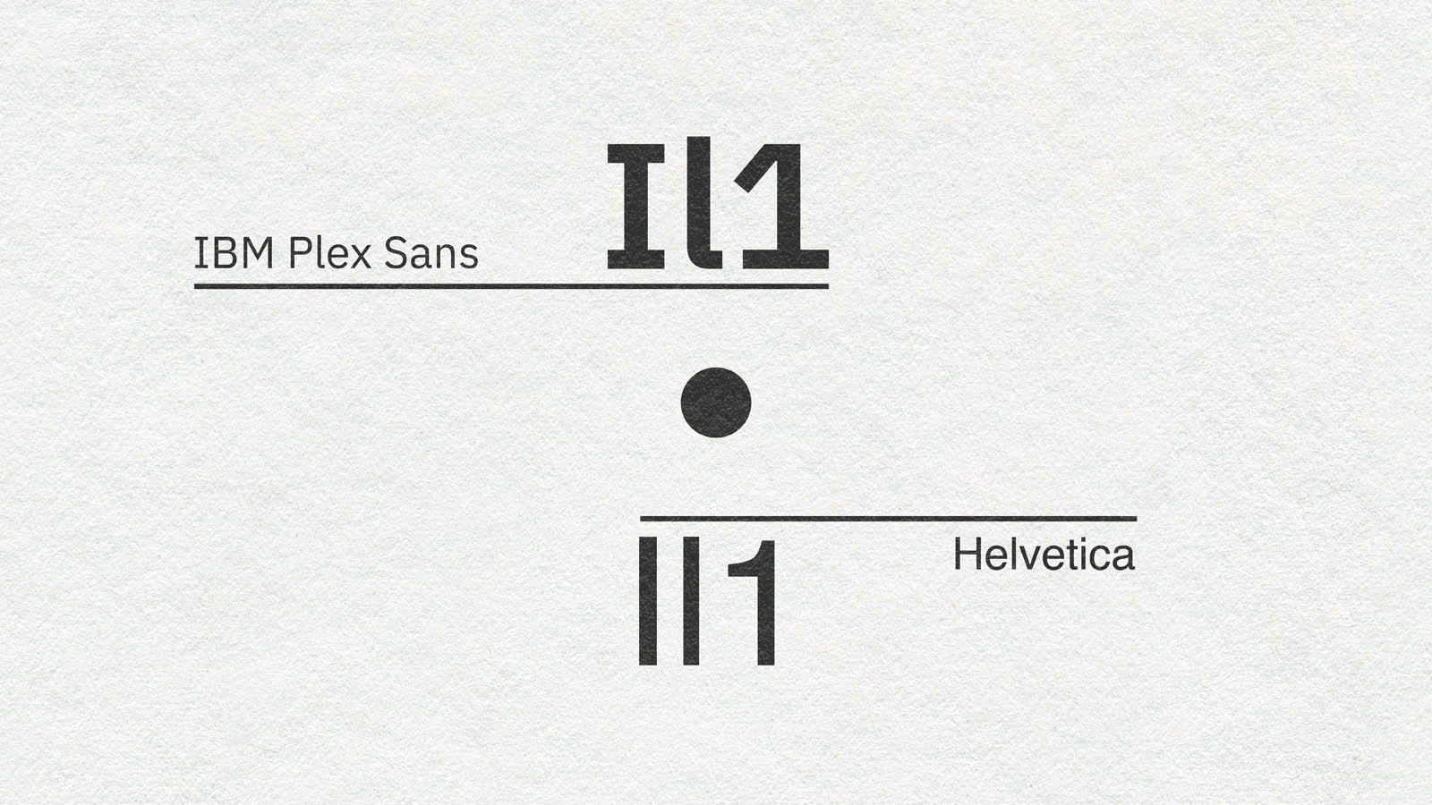
Some typefaces are more accessible than others, but one thing I look out for is differentiation between similar characters. In particular how the upper case “i”, lowercase “l”, and number 1 sit next each other: Il1. Also lowercase “o”, uppercase “O” and zero: oO0.
As you can see there isn’t always a clear difference, particularly with sans serif fonts. It’s a small thing but worth considering a few options based on the project.
At the moment, my go to choice for super accessible body copy is IBM Plex Sans. It’s available as a Google Font and comes in a range of options. See the article featured image for a comparison to Helvetica…
Colour Contrast
Best practice is to not rely on colour to communicate key information. When used – especially with text – there should be an appropriate level of colour contrast so that the letters are clearly visible and readable. Depending on the accessibility standards you are meeting (WCAG AA or AAA) this could vary.
With that mind it’s best to use a colour contrast checker tool if you have any doubts. Additionally you should avoid heavy colour clashes as they can be illegible and offer poor accessibility to users who are neurodivergent or colour blind. The article Why you should avoid vibrating color combinations by Eli Schiff is a god jump off point for more detail on this.
Technically inclusive design
When clients ask “what is inclusive design and how does it fit into my project?” these are the usual suspects that should be explained and included as standard.
These elements are not visible but sit under the surface of a digital document. They help people who use assistive technologies like screen readers navigate, understand, and get a fuller experience of a document.
Document Title
Sounds obvious and a title might not feel like inclusive design, but PDFs are often exported with their working file name, for example: “45_DCDW_INCLUSIVE_DESIGN_ARTICLE_2026_UPDATES_a4”. Useful to the designer, not so much for the user with a screen reader looking for a document called “What is inclusive design in 2026? From Colour Contrast to The Best Type Choice by DC Design Works”. The document title should be set as the title on the cover page with the correct author information. That way it’s easier for the user to find, and know what they are looking at when they download / open it.
Bookmarks
These are like a digital version of the contents page. They add structure at a document level and allow people to navigate quickly and easily with a click, without having to read the contents section of a document.
Articles
If bookmarks give document level structure, articles create structure within each section. It allows a user and their assistive technology to navigate the content in the correct order, rather than based on their software’s best guess.
Tags
We’ve structured the content, but tags define what each element is to the audience’s software. Tables, images, headers (H1, H2, H3, etc.) vs. the body of an article: tags allow easier navigation and a more granular level of detail to the audience.
Image Alt Text
A screen reader may know that it has found an image file because of its tag, but it doesn’t know what the image is. Alt text describes the content of an image to give the audience a fuller experience, or explain a complex graphic / visualisation. Many software platforms use AI to help with this now, but remember: AI doesn’t have eyes – always check before releasing AI alt text to the world.
Link Descriptions
Similar to image alt text, these are really useful to describe where a link takes the user before they click. Do not use link text like “click here” or “download here”, or the full URL. Links should be meaningful so work the title of a linked document / website into the content rather than a generic link that makes it harder to navigate, and less clear.
Test
You’ve done all the above, so now it’s time to test these accessibility features in a PDF reader. I use Adobe Acrobat for this. It’s a great way to catch things you’ve missed in a longer document. You can also edit / make small corrections in Adobe Acrobat itself rather than reexporting from InDesign.
An alternative tool for checking PDFs is PAC – PDF Accessibility Checker.
So, what is inclusive design in 2026?
It’s good, considered design that maximises the reach and audience for your work. It adds value to the user, but also, by being accessible it adds value to a website.
It’s an ever developing landscape with a noble purpose: to make more information useful and clear to more people. And I expect to have to regularly update this article to reflect this dynamic space.
If I’ve missed anything / got anything wrong, I’m always open to learn more about inclusive design as I believe that it is the foundation of good design.
Feel free to email me on [email protected] if you’ve got anything to add, or if you’d like to talk about your next graphic design project.


