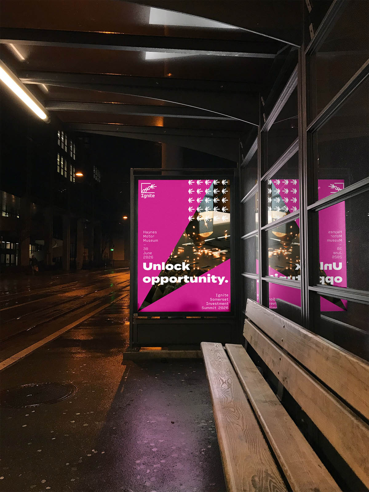
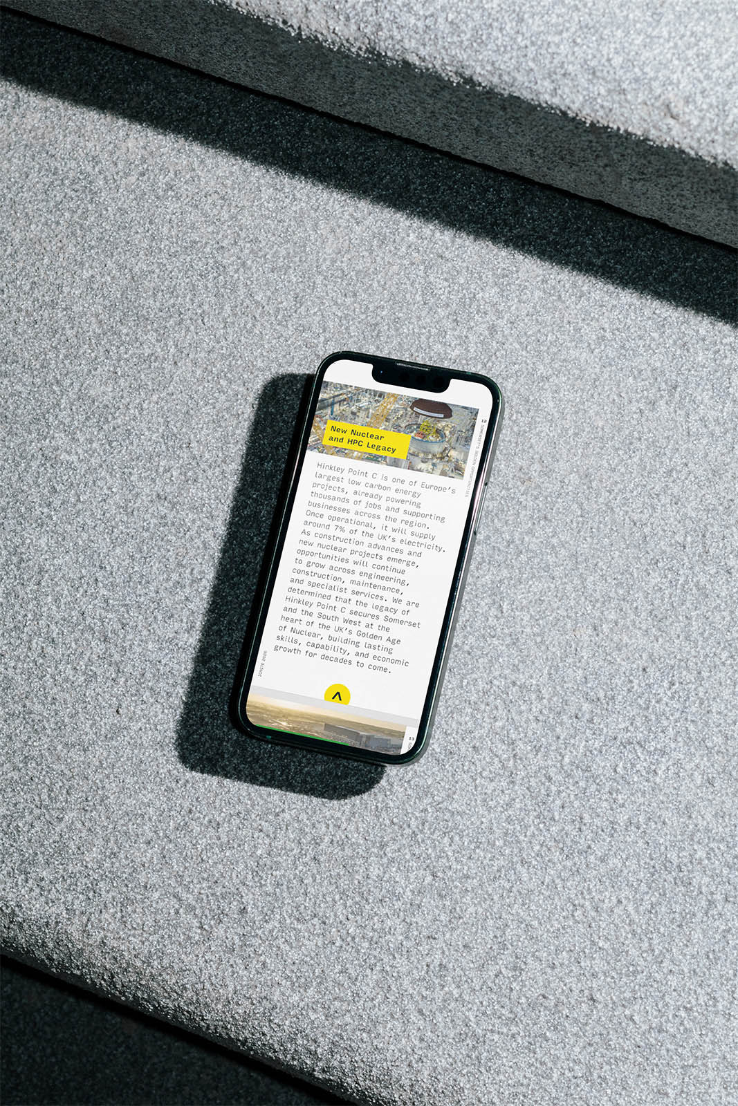
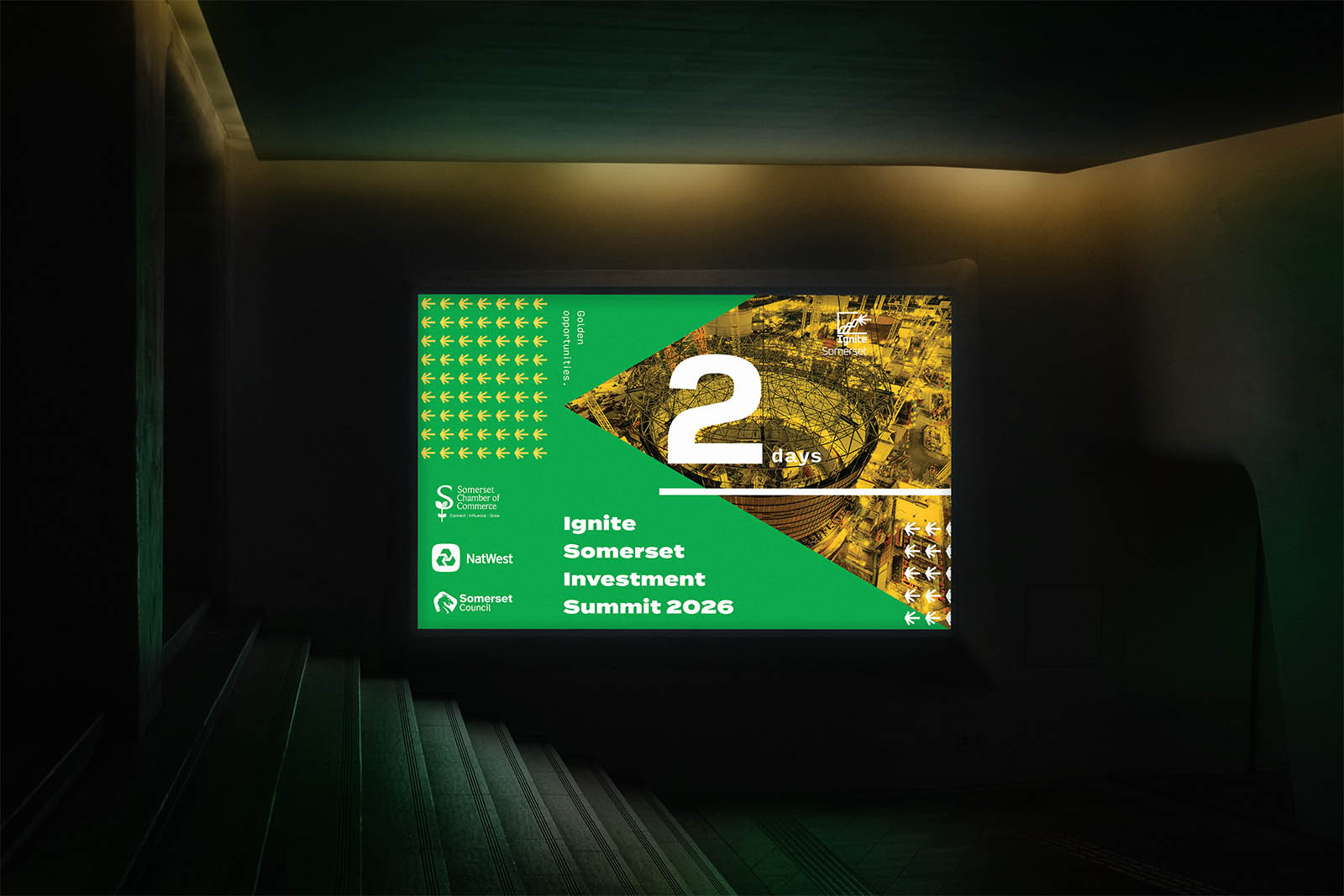
The leadership focussed brand and logo design Somerset Ignite summit used to spark investor interest.
Project partner Tech South West worked with stakeholders to deliver the brief for this brand identity and logo design: Somerset Council and Somerset Chamber need a logo and identity to signal confidence, ambition and economic credibility.
Logo Design: Somerset Summit
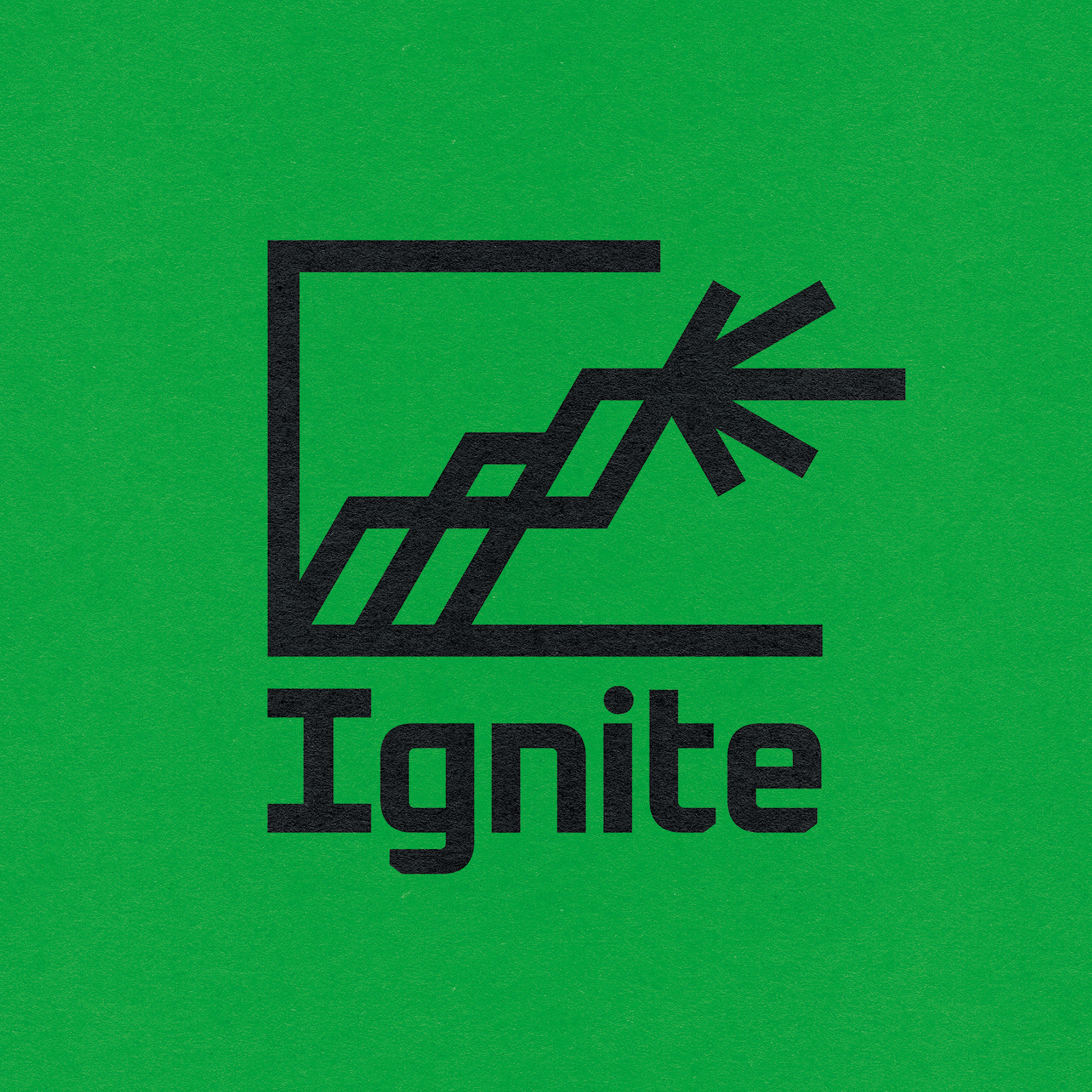
A modern, confident, literal representation of a summit that packs in a lot of key values of the Ignite brand and mission.
The lines lead the eye to a summit where a beacon bursts out of the container. It serves as a literal interpretation of ignition: a spark.
Thick lines and wide base give it a tangible, concrete confidence. Its sharp edges and corners give a precise, serious feel.
The beacon looks forward, breaking the container. It leads the way, looks to the future, and by breaking through the container creates a sense of openness.
The rising lines can be interpreted as the rising lines of graph, or the Somerset landscape of contrasting wetland and hills. It suggests economic credibility and ambition as it climbs with a subtle “i” within. It is finished with a wordmark set in Oxanium bold with modification to the upper and lowercase “i” to enhance accessibility.
A Non-Council Visual Identity
Colours
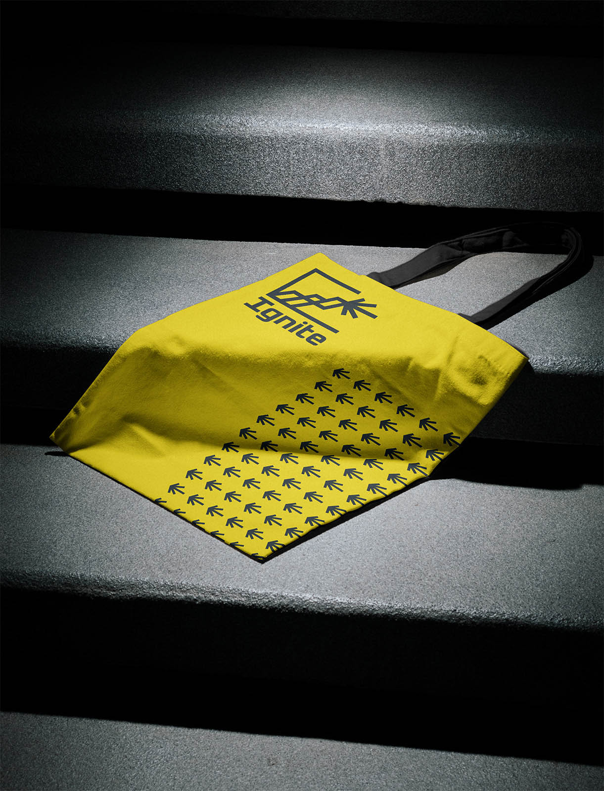
Electric yellow, magenta, lush green and deep blue offer a vivid colour palette which can be tinted to offer a wide range of options in terms of energy and contrast. They will allow the team to create bold statement pieces as well as accessible layouts with great colour contrast.
As the project is heavily supported by Somerset Council, the decision was made to anchor the identity with a cool black. This ensures there is no perception of political bias, with the other colours offering context suitable options.
Typefaces
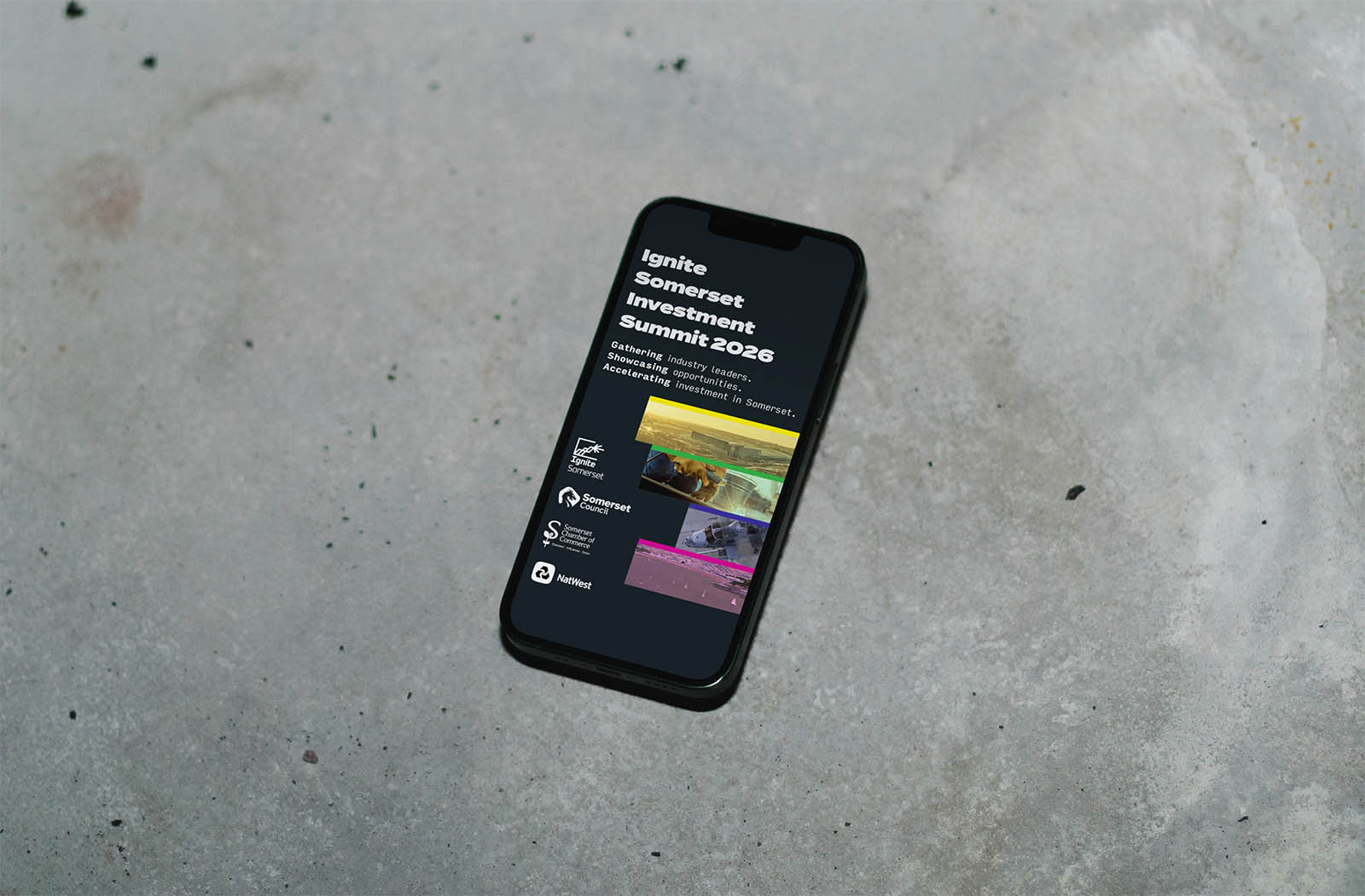
Termina in its various weights is a confident, solid typeface that offers impact and character in every headline. It sits in counter point to our body copy typeface.
Input Sans is finds inspiration in early computer consoles but moves beyond those classic mono spaced typefaces. It has good legibility and a range of seven weights. It is our go to choice for body copy.
It has features that really lean into inclusivity, such as differentiation between characters like 1Il or oO0. All while having a look that feels modern and authoritative.
(Check out this article to learn more about inclusive design .)
Looking for a partner for brand identity and logo design? Somerset clients – and client from across the UK – are always welcome: get in touch today.