After the success of our collaboration on their Netherlands market report, we agreed adopt the same grid system adjusted to suit the slightly smaller screen format.
This offered familiarity to readers, as well as a proven – and agreed – structure for the HTA’s content.
As with earlier work with HTA the use of magazine-style elements add a dynamic feel to the piece. Drop caps, considered column widths, bold pull quotes and clear hierarchy of type size.
While individually small, these elements combine to make the reader’s journey through the document as smooth as possible.
There was also an element of colour-coding required for the content. This was to communicate the piece’s five distinct areas of focus:
Reducing HTA members’ carbon footprint
Reducing stress on the UK water supply
Increasing circularity in horticultural plastics
Increasing sustainability of growing media
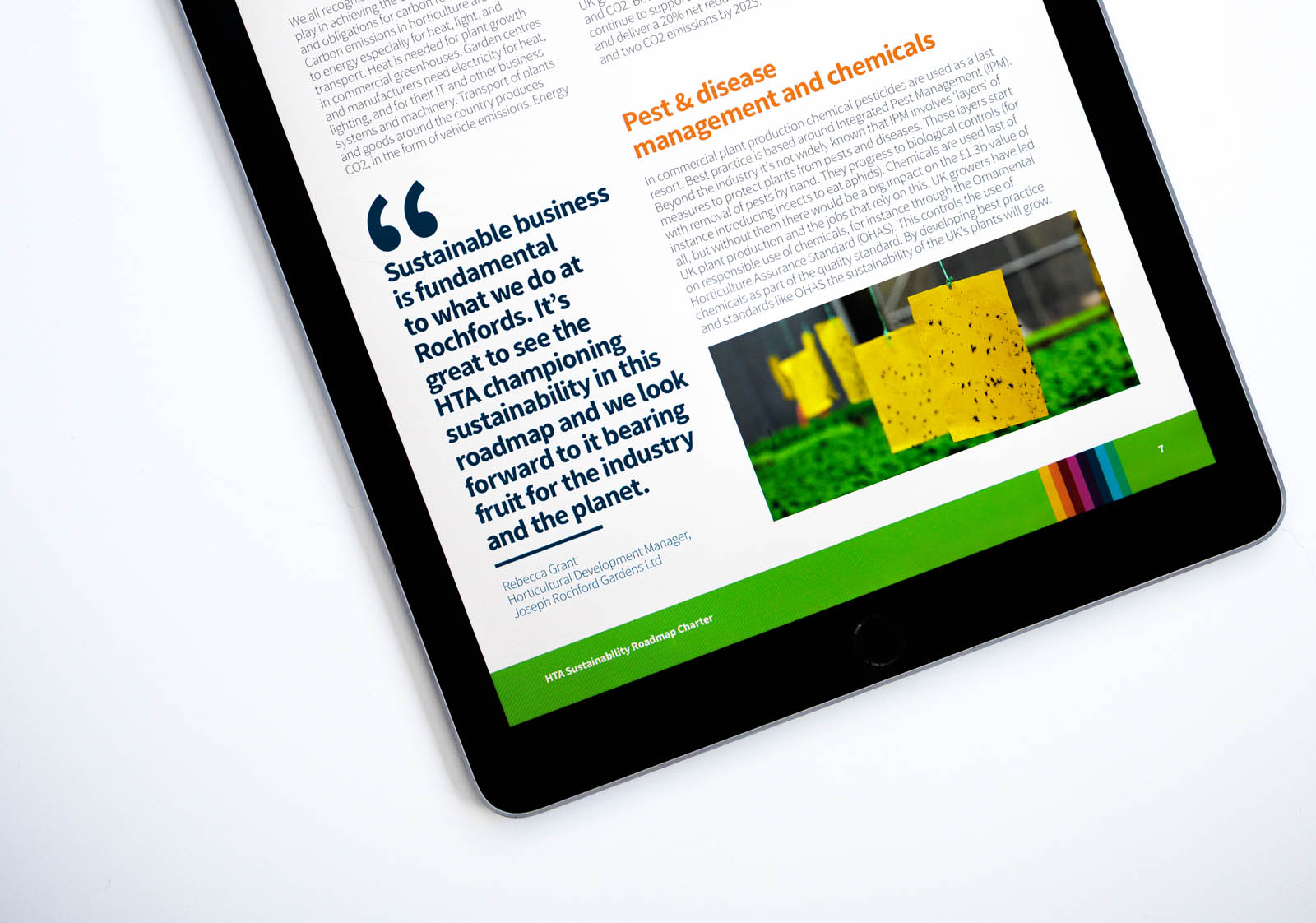
Fostering innovation in pest and disease management
As well as support the audience’s navigation through the document, this colour-coding fed into HTA’s other sustainability communications and iconography.