Distinctive restaurant logo design and brand identity that stands out in a competitive high street market.
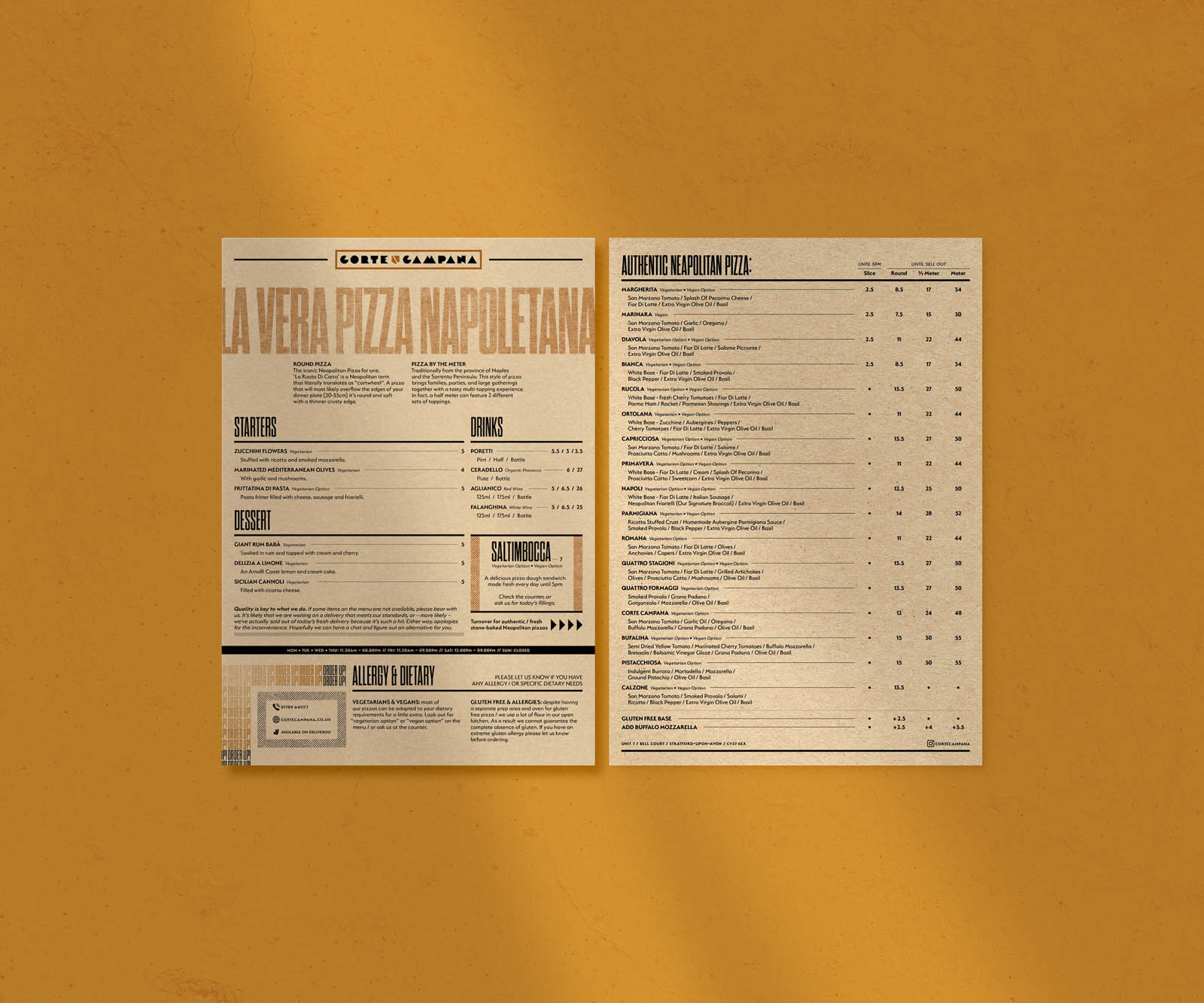
Additionally, the identity needed to allow room for the brand to grow as it diversified from an initial offer of pizza by the slice, round and metre into other traditional Neapolitan foods.
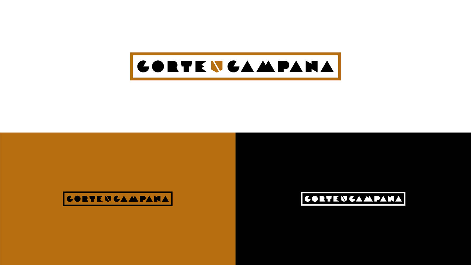
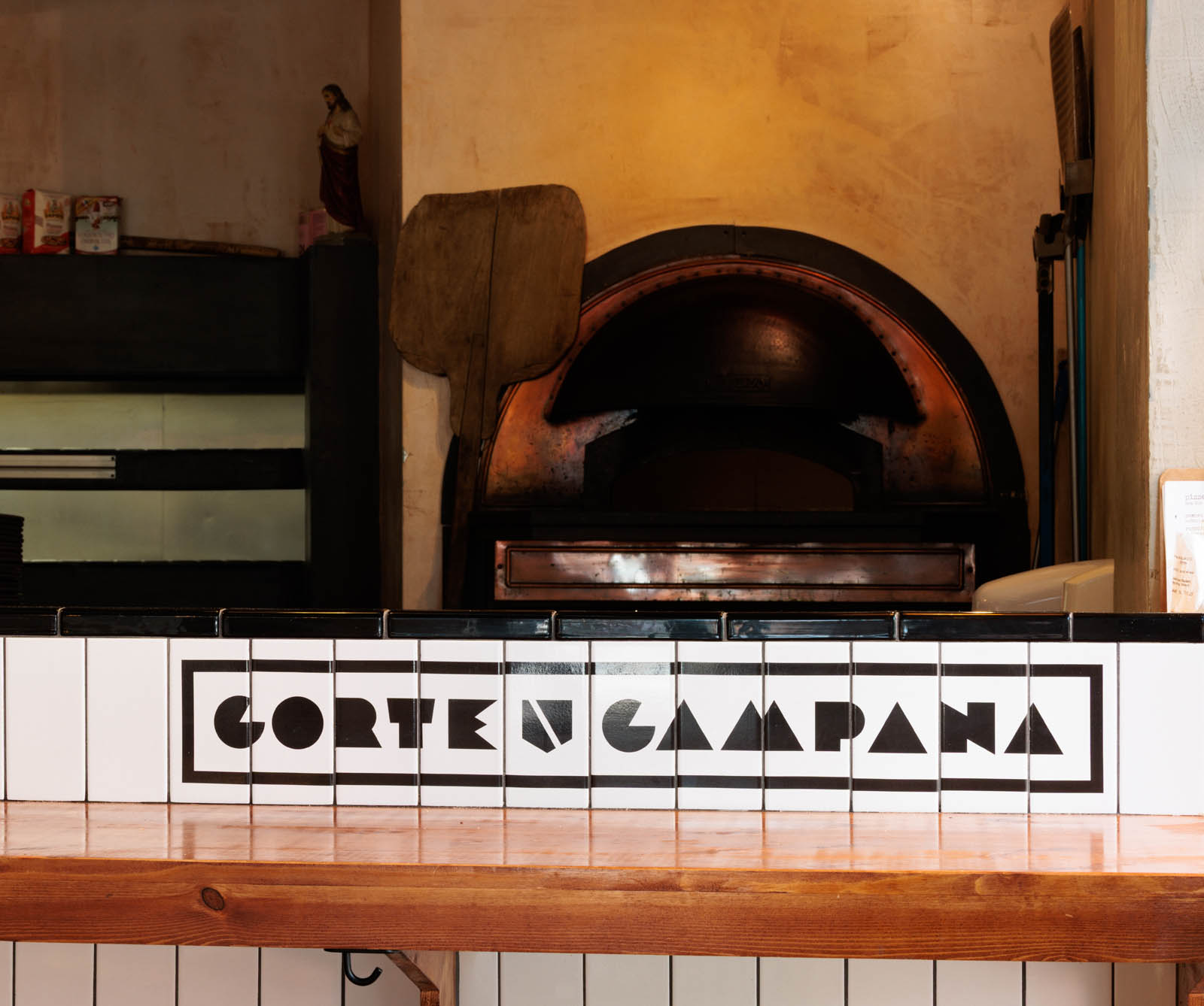
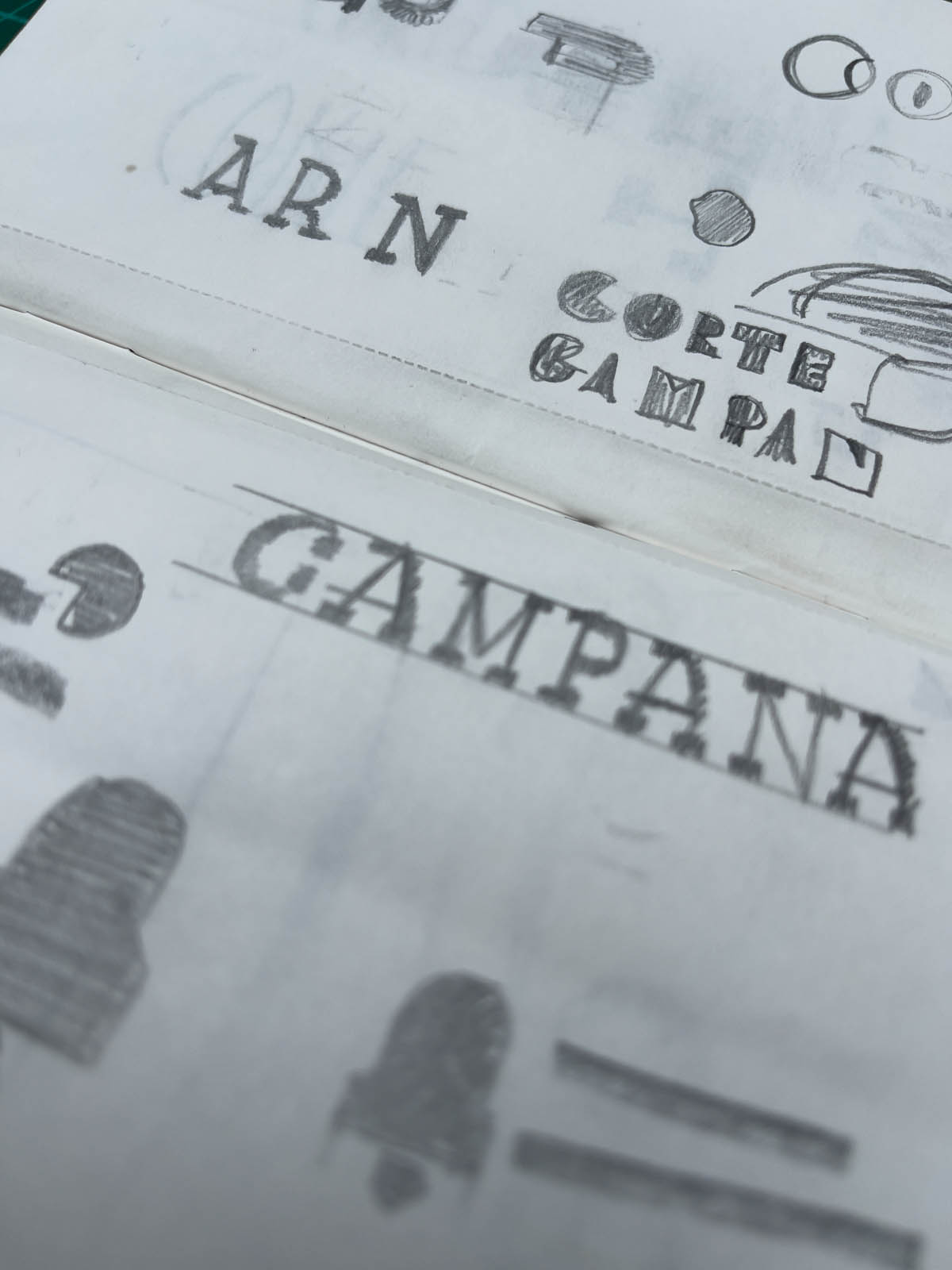
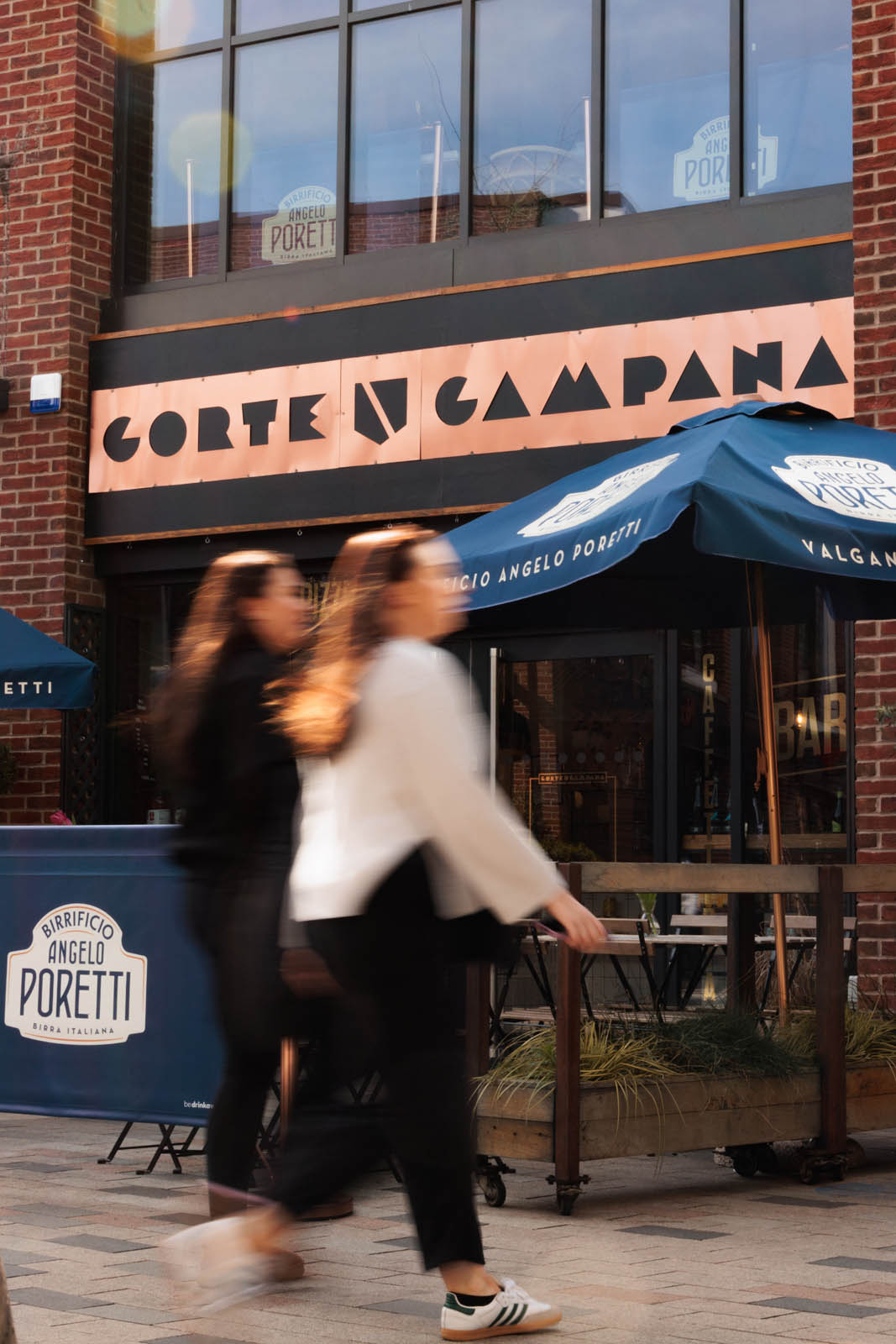
The design solution draws inspiration from vintage Italian print ads. Chunky shapes combine to create a playful, confident logotype like nothing else in its space.
The “C” reminiscent of a pizza with a slice removed. The “M” a nod to Mount Vesuvius, the iconic volcano visible from the founder’s hometown. This characterful type design helps tell Corte Campana’s story as well as set it apart.
A geometric and stylised Campania coat of arms compliments the logotype, and anchors its Neapolitan roots. A thick boarder line finishes the piece and pulls it together in a clean, balanced mark.
Now a key part of the business’ visual language, this restaurant logo design is part of a wider brand identity project which has grow as the business moves from success to success.