As part of the UNESCO Creative Cities Network Exeter City of Literature champions local stories, storytellers, and the wider creative community.
With such a broad mission, it’s important to have a clear brand strategy to achieve aims, and use thoughtful graphic design to present it in an engaging way.
As well as impact, this embodiment of the strategy needed to last the five year strategy term. It should feel as visually relevant in the 2025 / 2026 period as it does in 2030.
Central to the balance of impact and longevity was simplicity.
The underlying modular grid maintains clear, consistent layouts over 44 pages. The choice of Helvetica for type adds an ageless, familiarity to the spreads.
Together the grid and type combination provide a rock solid platform to inject playful, visual identity cues that enhance the content and reflect the brand.
This is key to longevity: rather than relying on these cues to carry the piece, they are there to embellish and elevate it.
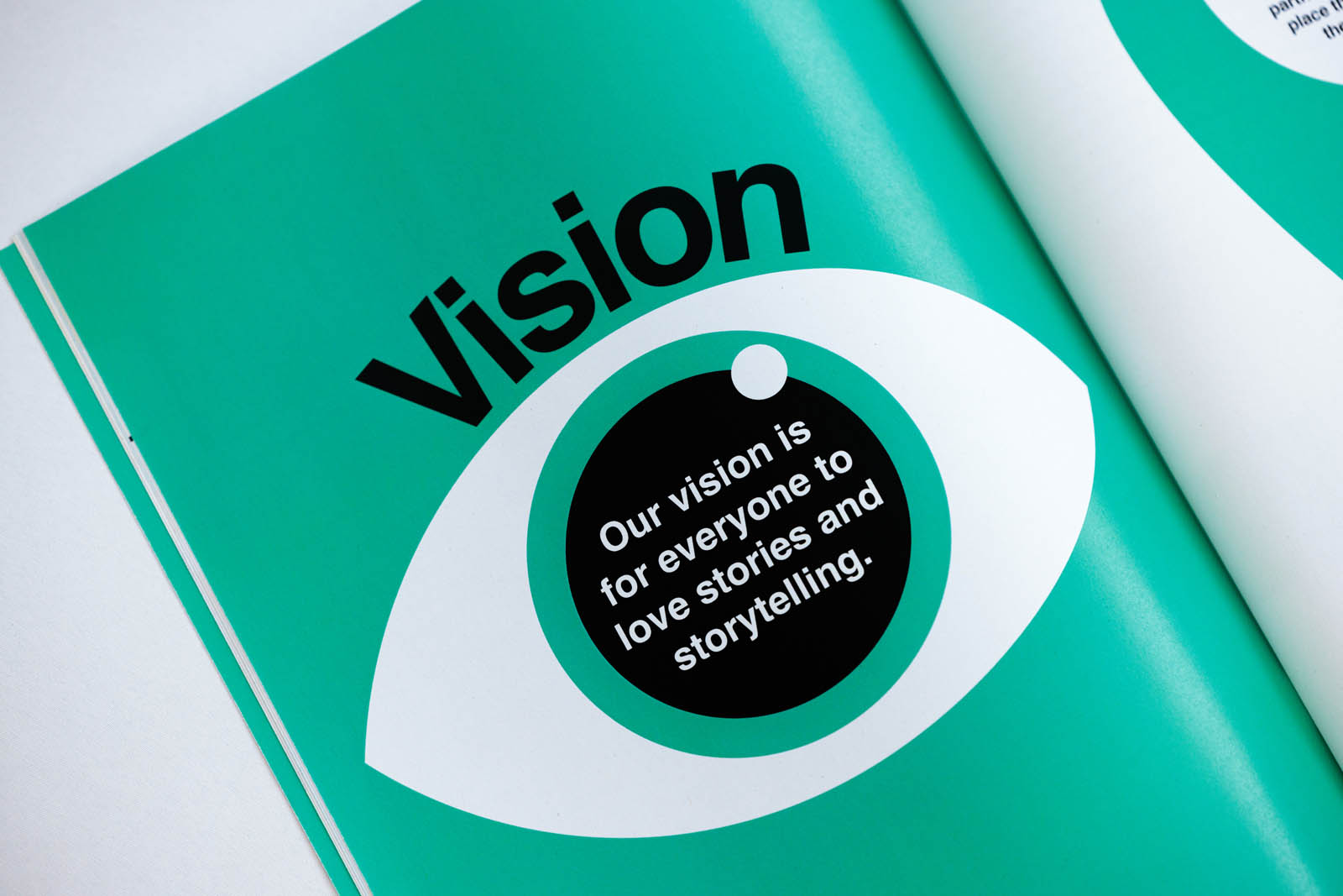
With a strong, functional structure in place it was time to bring in colour, shape and play.
Recurring visual motifs across the document reflect the overlapping pages of the Exeter City of Literature logo. Overlayed colourful rectangles and circles add interest and lead the eye through content.
Use of Landi Echo for drop caps blends modern type forms with a practice that looks back to early literary traditions. Something present in the Exeter book – one of the oldest examples of English literature.
As with any project the goal is to create something functional, with staying power, that tells the brand story. This collaboration with Exeter City of Literature achieves that with real zing.