Luxury diamond brand Rafayel needed modern logo design to help move their brand forward.
As sister brand to EverAmour, Rafayel needed to complement and stand out in its own way.
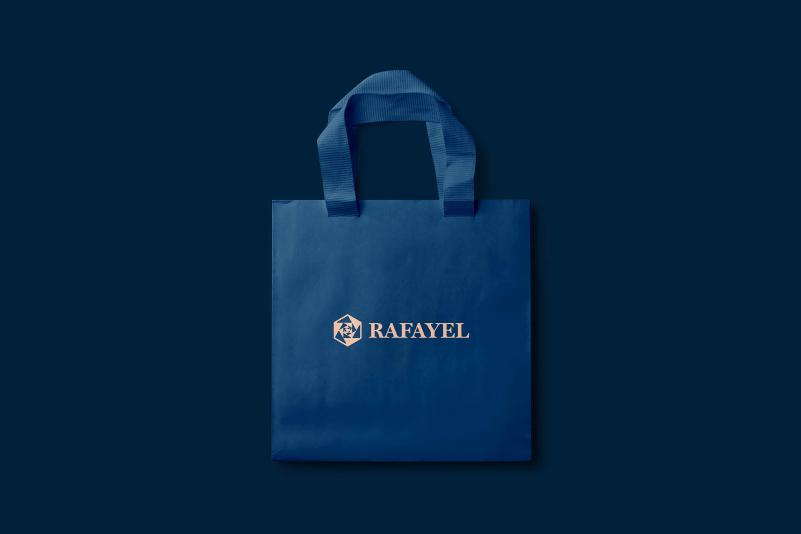
In a marketplace dominated by monograms and logotypes – and increasingly visible critiques of “bland” modern logo design – we committed early on to a solution based on a simple, recognisable icon.
The wider brand identity development needed to acknowledge luxury, femininity, romance, and the business’s environmental credentials.
Because of its relationship to nature and romance, we landed on using a rose as our focal point. We developed it further with strong contrast and geometry to resemble a cut stone in a nod to the product offer and luxury.
The strong geometry is based on a hexagon and spirals inwards to pull the eye in. The contrast represents the different light and shadows as light passes through a gemstone.
The final step was to round the inner dimensions and corners to make the finished logo design feel softer.
This was ultimately paired with the typeface “Charter” set in all caps. The choice of typeface was to keep a visual reference to the EverAmour logo which also used Charter as its logotype.
Once this new modern logo design was approved by the client we developed a colour palette to complement it.
Deep, luxurious blues offer contrast to blush pink, soft gold, and cool grey. Colours that nod to femininity, luxury and refinement without screaming it.
Coupled with classic typeface Bodoni for headlines and the more modern Univers for body copy, this visual identity is subtle and stylish.
It manages to stand out among competing offers, without having to shout loud.