Logo and brand design to reflect and promote Warwickshire’s vibrant visitor offer.
Visit Warwickshire needed a new identity with strong commercial appeal to compete with leading county brands such as Visit Cheshire and Visit Northumberland. The new logo and brand design needed to position Visit Warwickshire as distinctive, competitive, and ideally located.
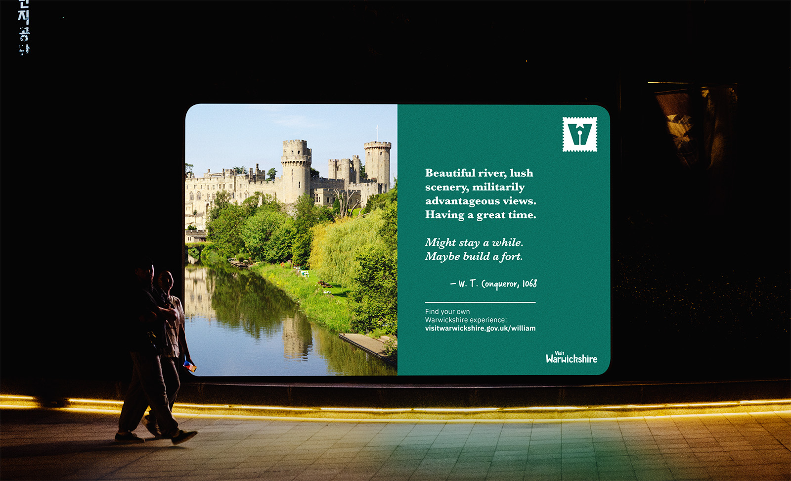
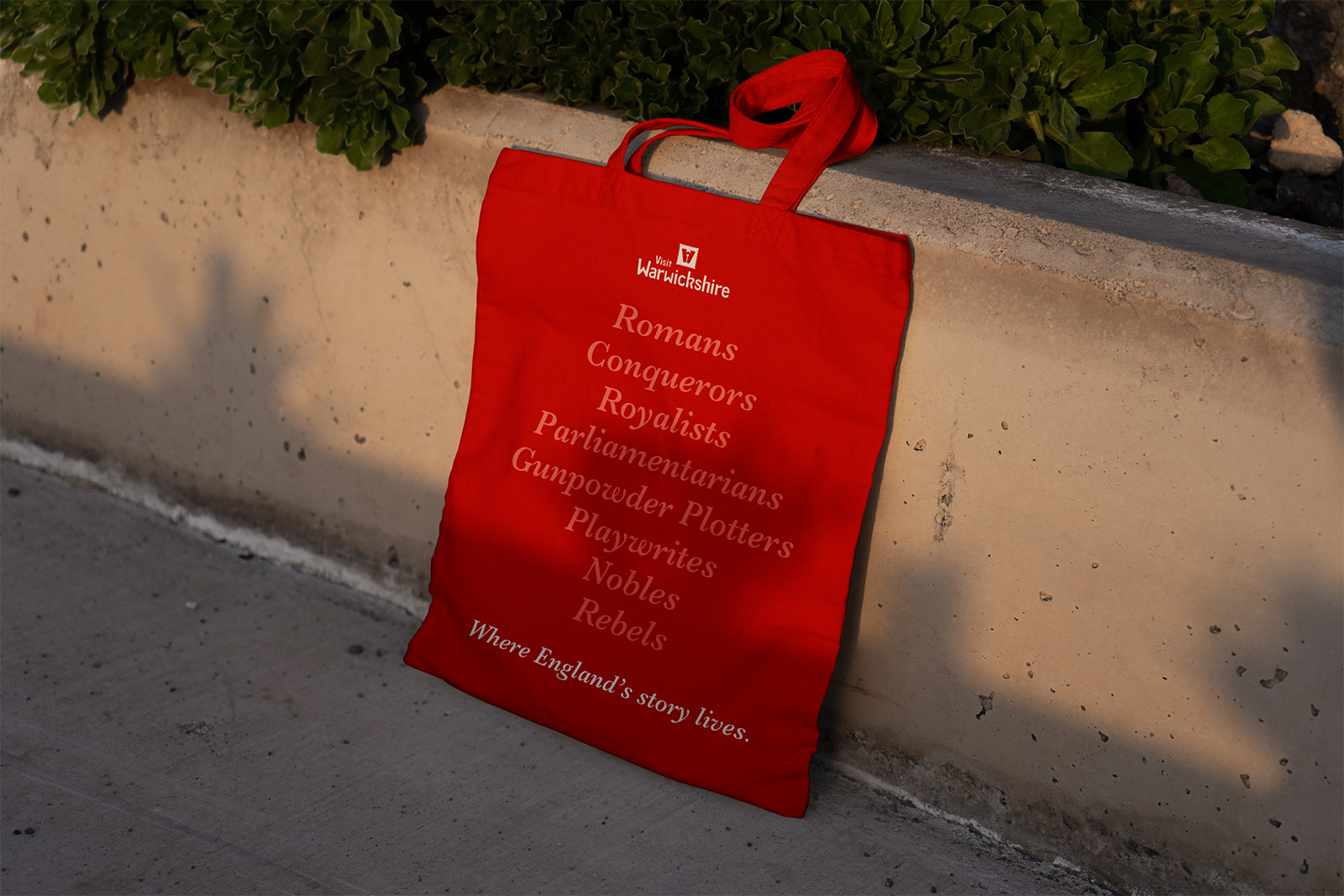
Most importantly it needed to communicate the core brand proposition: “where England’s story lives”.
A core pillar of the project was to establish a strong symbol and custom type that held value for the project’s various stakeholders in the county council, the five districts and boroughs of Warwickshire, and partners such as Stratford-upon-Avon BID and Shakespeare’s England. In particular, Stratford-upon-Avon and Shakespeare needed to be clearly acknowledged as research showed that most visits use these as a central part of a trip to Warwickshire.
Modern logo design for rich heritage.
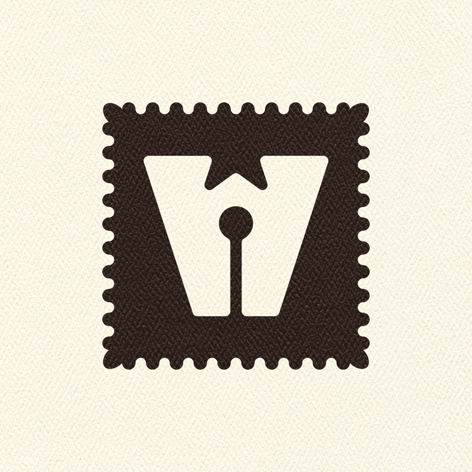
A new shorthand for the Visit Warwickshire brand is a chunky, confident, playful “W” icon. It leans into the literary heritage of Warwickshire, and the brand proposition of “Where England’s Story Lives” with the lower negative space of the “W” styled as a pen nib.
By giving weight to the literary heritage in this way, we also support the Warwickshire Tourism Growth Plan Market Summary which anchors our offer with the Shakespearian heritage of Stratford upon Avon. It’s geometry is simple and strong. Primarily based on pentagons for the angles of the base and sides, and a pentagram star for the upper recess.
Its abstract nature is a strength. It is always a “W” but there are the opportunities to uncover more based on context: a drop pin, a pen nib, a castle. Importantly it stands out from the landscape of competing “Visit…” logos. The different elements and angles of the “W” lead the eye to the wordmark below, while the use of an oak leaf edged container brings visual balance and energy.
The oak leaf acts as a reference to a broader English heritage, as well as a Warwickshire-specific story of the Watch Oak in Kenilworth where Cromwell supposedly viewed the bombardment of Warwick Castle during the civil war.
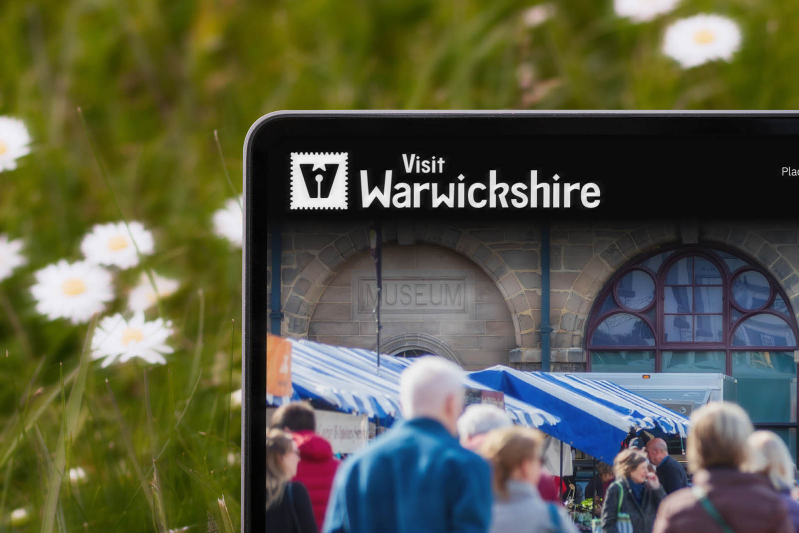
Our wordmark is a bespoke sans-serif typeface with humanist leanings. It is designed to bridge the modern and heritage elements of Warwickshire’s identity. Within the negative spaces of the letter forms are references to famous of elements of the county’s history and identity.
Wider logo and brand design elements.
There is no primary brand colour for Visit Warwickshire. A core reason is the unique position of the brand, sitting in a political landscape where colours each carry their own baggage.
Instead there is a diverse palette with foundations of a red based on the St. George Cross, an inky blue, and deep green. These are punchy
tones that nod to the natural landscapes of Warwickshire and its English identity.
They are supported by a peach, rose and aqua secondary palette to offer more complexity. A palette like this creates opportunities to
be vivid and clash, or be subtle to suit online contrast / accessibility requirements.
Our choice of type for this visual identity is a direct marriage of modern and heritage.
Baskerville is a classic, easily recognisable, serif typeface designed by John Baskerville in 1757. It was designed in the historic county of Warwickshire, which then incorporated Birmingham, so there is a historic link to county’s past.
In contrast we have IBM Plex Sans for all body copy. Released 260 years after Baskerville, it offers modernity, legibility across digital and print, and maximises inclusivity within the design.
Got a logo and brand design project you’d like to discuss? Get in touch.