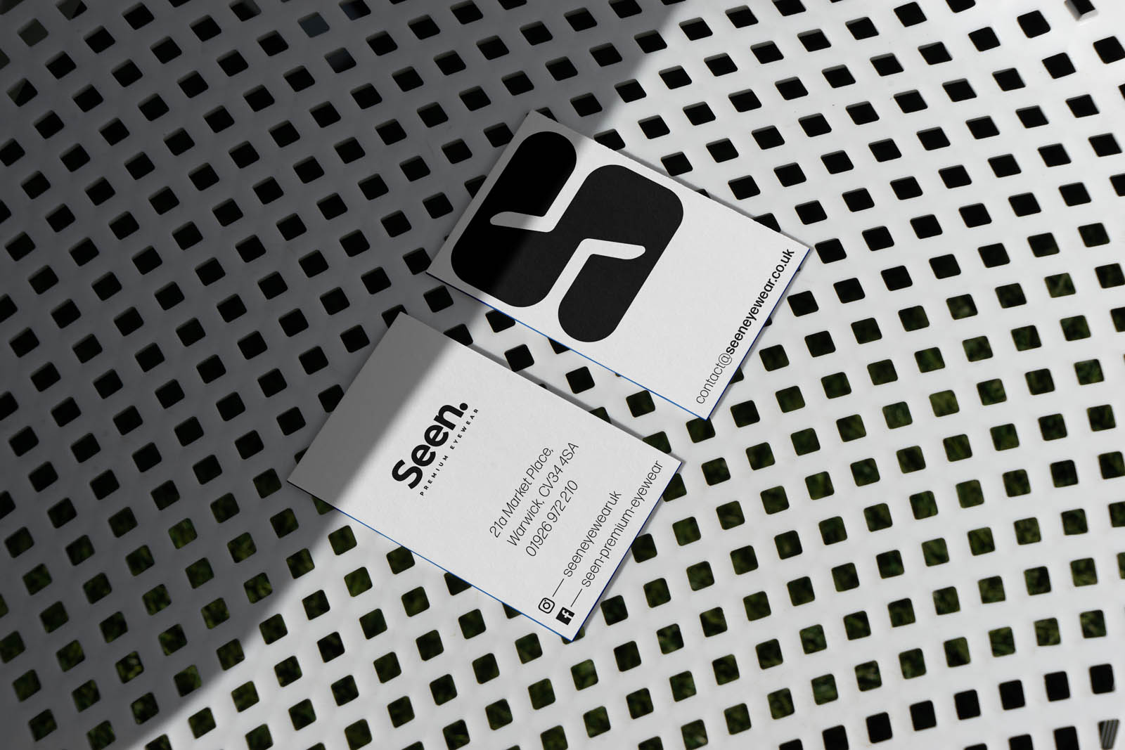
The brand already had an approved logo wordmark, but after discussions we decided to support it with an icon.
This was in addition to supplying brand identity guidance and graphic design support across stationery and posters for the store front windows while the fit out took place.
With over 20 years of experience within the industry, the team behind Seen had clear direction for their service offer: luxury frames fitted with precision.
After the initial brief and development of a brand strategy we landed on the core values of: confident, precise, and personal.
These are the values which guided the rest of the project.
As Seen don’t offer eye tests, any visuals shouldn’t suggest that as a service.
With this in mind we avoided using the eye itself as a visual cue.
This is why we landed on an “s” icon where the negative space is taken from the arms of a pair of glasses.
It’s subtle and classy. A nod to the product offer that is confident and adaptable.
The confidence of the icon is felt across the suite of materials. With clear, confident placement that can serve as an anchor as well as a window for products and photography.
The poster designs serve to introduce the brand to local residents before the store opening, while the business card, comp slip and letterhead designs offer memorable brand touch points to visitors and customers.