For this coffee shop logo design was key to their rebrand.
Rosie, Tony and the team were about to relocate their much loved coffee shop to a new unit. With the move came an opportunity to move the visual identity and brand forwards.
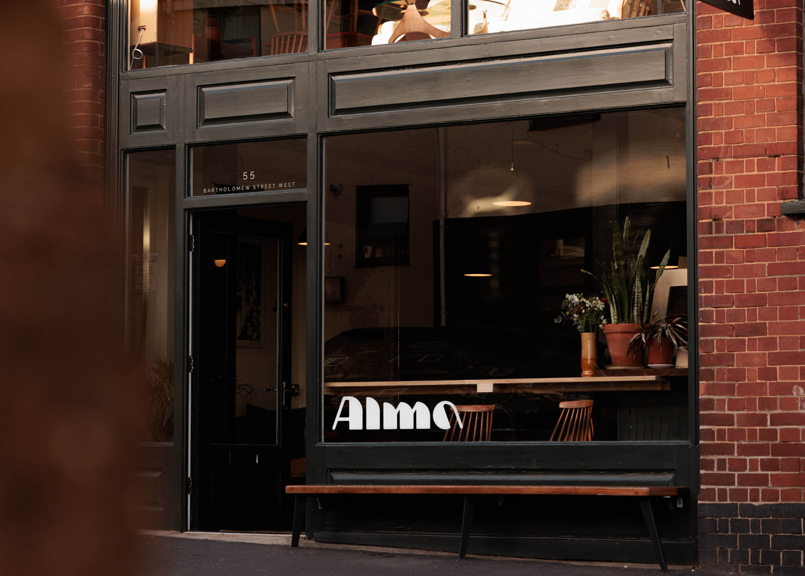
A big part of this graphic design project was 130 Basement (the original business name and address) becoming Alma.
Community, inclusivity and fun are core pillars of the brand and we needed to develop something which built on a strong reputation and foundations.
The word “Alma” has many meanings across languages: soul, spirit, nourishing, but the one that really resonated with this project was “kind”. And to be kind is to be friendly, generous and considerate.
We explored a number of options early on including light feathers, and chunky “A”s that evoked welcome, open doors. As we moved forward a work mark began to take shape.
Heavily influenced by high contrast mid-century design (Rosie and Tony’s core style reference), and reflective of their furniture, this coffee shop logo design really nailed the brief. It has generous proportions, confident weight and geometry, and the curves add a sense of fun to the rolling form.
Each letter becomes its own character and offers variety within a unified set. In particular the upper and lowercase “A”s can act as recognisable stand alone icons.
As we expanded the identity it made sense to keep things simple. For typography we went with Forma, a beautifully understated mid-century typeface in two weights for simplicity.
For colours we used the coffee shop’s beautiful interior design by Pea Green Studios to develop a subtle palette of muted greens, rich ochre, and soft cream.
This project was such a privilege to be part of. The team at Alma have made us – and many other folks – feel so welcome since in Exeter.
I can’t wait to see this coffee shop logo design and the wider brand evolves as Rosie, Tony, and the Alma team grow into their beautiful new space.