A brand refresh that required clarity and sensitivity.
Luxury brand design can be a tricky prospect. In the case of EverAmour it was more complex given the subject matter and product.
EverAmour provides a service that collects a sample of ashes from a loved one. Those ashes are used to create a unique diamond set in a piece of high-end jewellery.
The goal was to move the brand forward with a visual identity that reflects where they are heading. As well as colour, type and photography, a core part of the work was logo development.
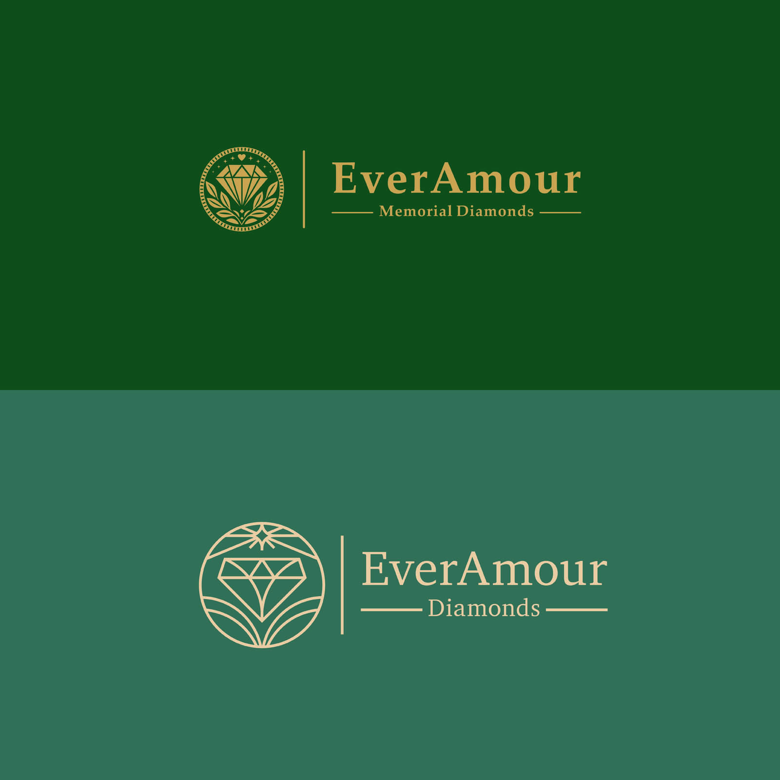
EverAmour’s original logo was dense with elements: stars, leaves, hearts and a diamond. We agreed to create more space within the logo and reduce the number of elements.
The result is a single shining star to represent remembrance, stylised leaves that are an extension of the circle container and represent eco-consciousness, and the simplified diamond highlights their core service offer.
Type and lines were tightened to make for a more compact form. Overall the logo is cleaner, more effective at smaller sizes, and feels more in line with the brand’s premium offer.
But a brand refresh is often about more than a logo design. There were inconsistencies across how the corporate colours were used and appeared across channels – these were refined and locked down.
Doves Type* was selected as the headline typeface across communications, with Baskerville as the body copy typeface. Both have a classic, elegant feel.
The final step was to develop a basic guide for photography and a treatment to make images uniform. As you can see from the example, the approved route involved simple, monochrome images overlaid with a green filter.
This approach makes for cleaner layouts, and easily identifiable communications. Overlaying champagne coloured type to frame products is the final touch to elevate the brand identity.
–
*”Robert Green’s facsimile of the famous Doves Press typeface, a digital reconstruction devised using the original metal type salvaged in 2014 from London’s River Thames.” – learn more.