Not all education providers understand the value of graphic design. Midlands preparatory school The Croft does.
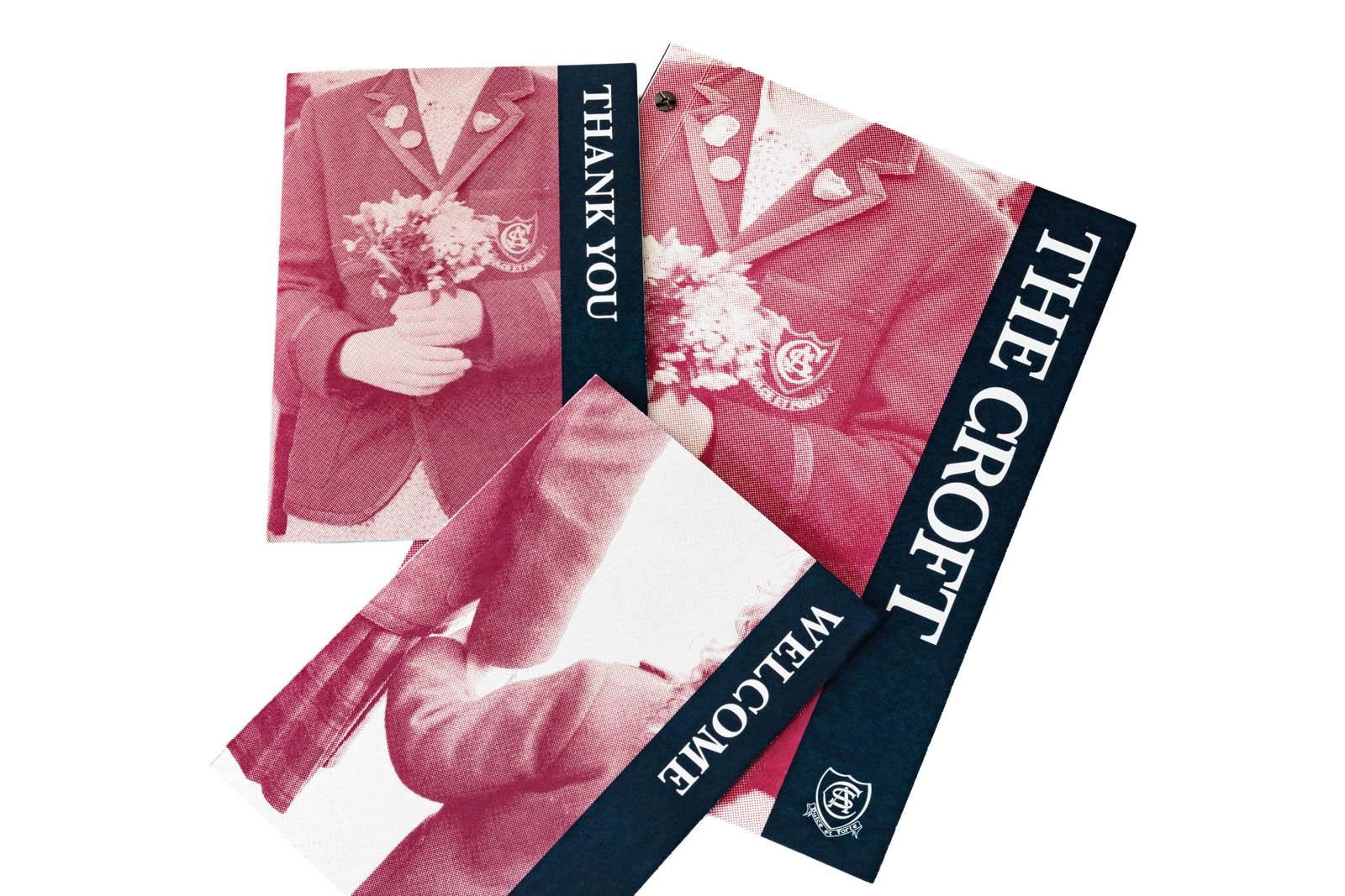
The team at The Croft needed a prospectus and materials that served as a foundation for their relationship with new and prospective parents. To achieve this we developed a piece with real impact off the page and in the hands.
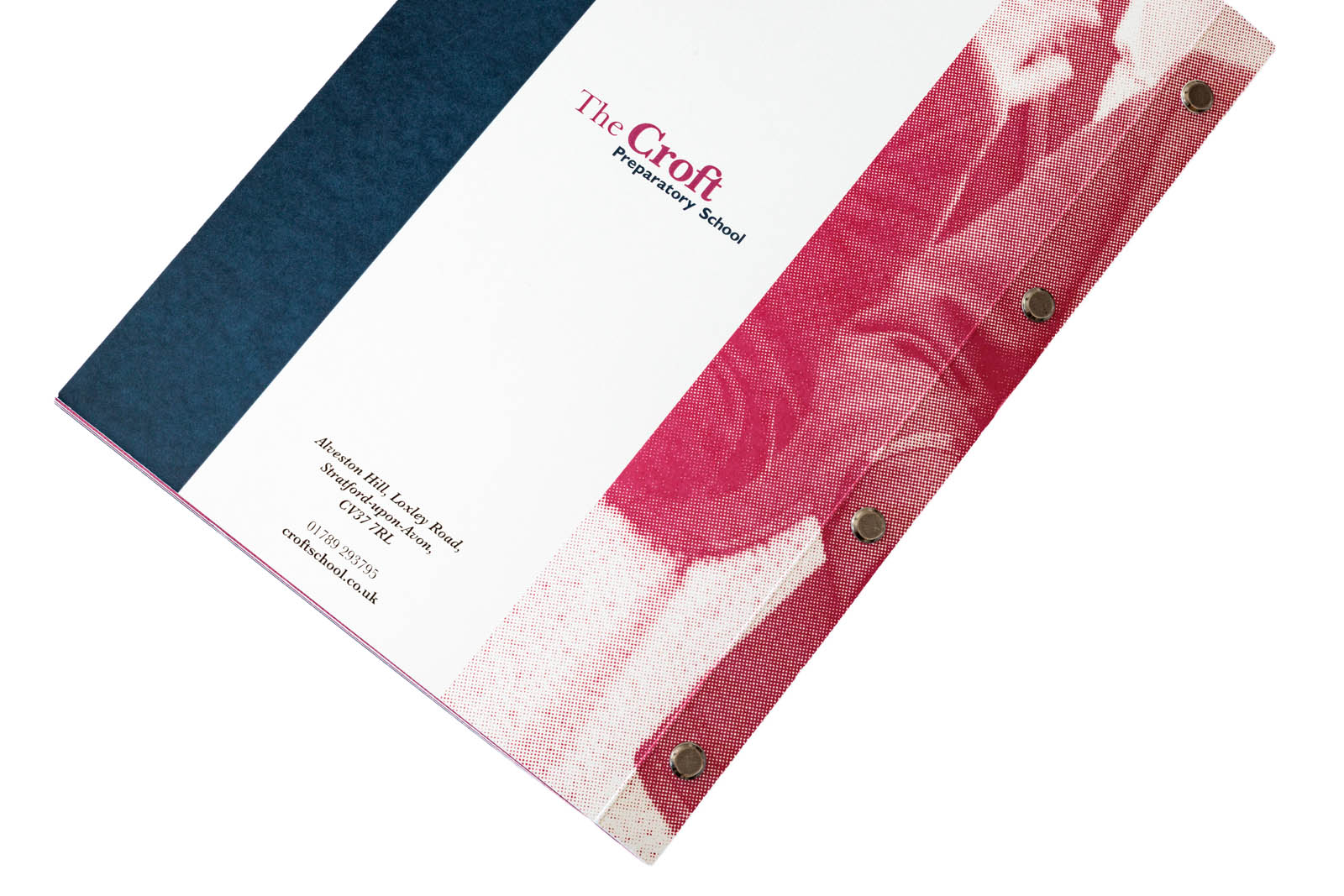
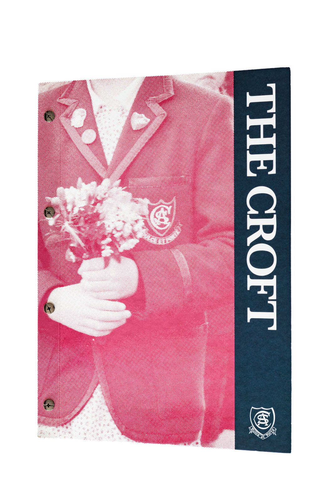
Early on we agreed a rivet-bound format with the client. As well as offering a physical format with a striking look and feel, it offers the option to add and remove pages by unscrewing the rivets.
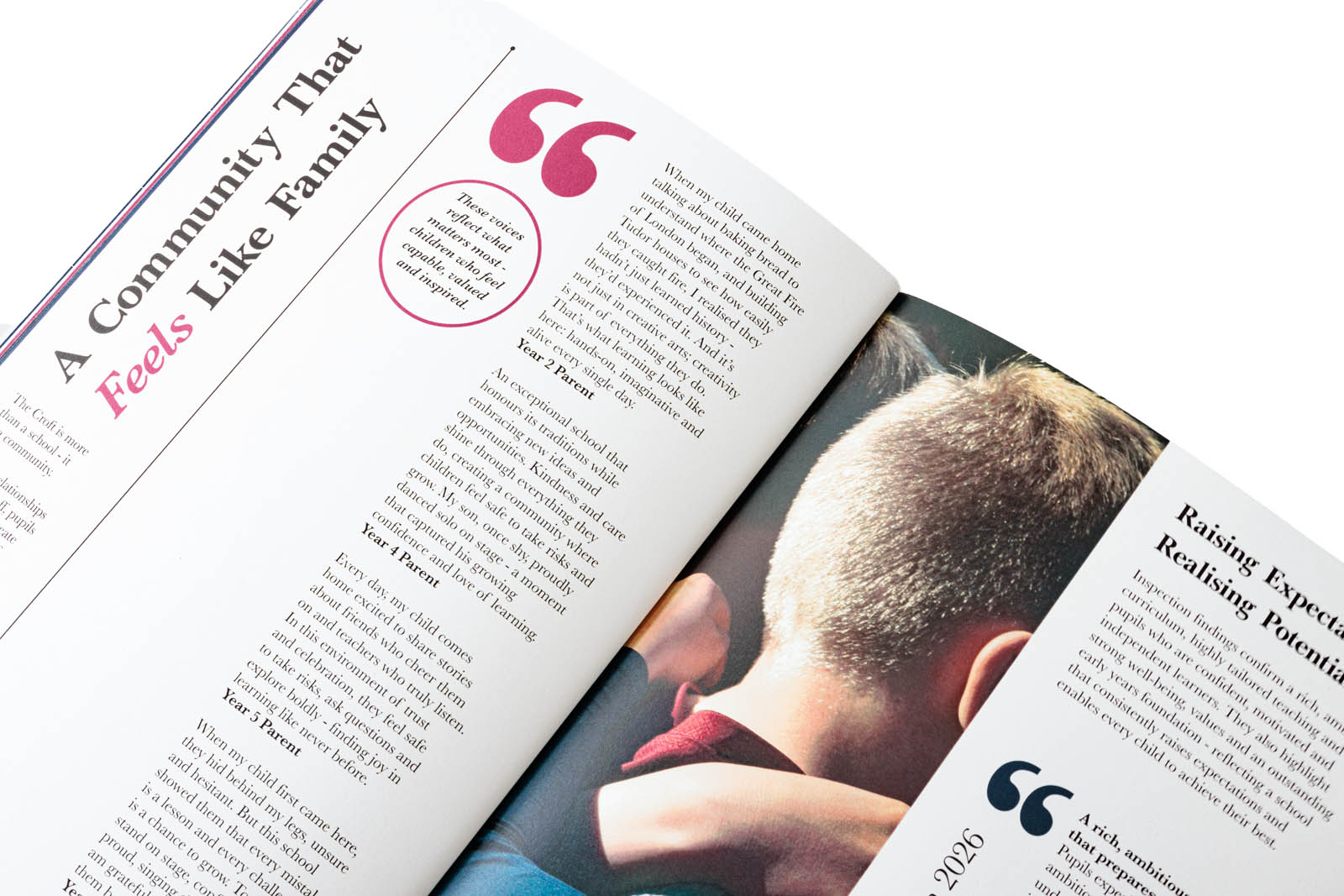
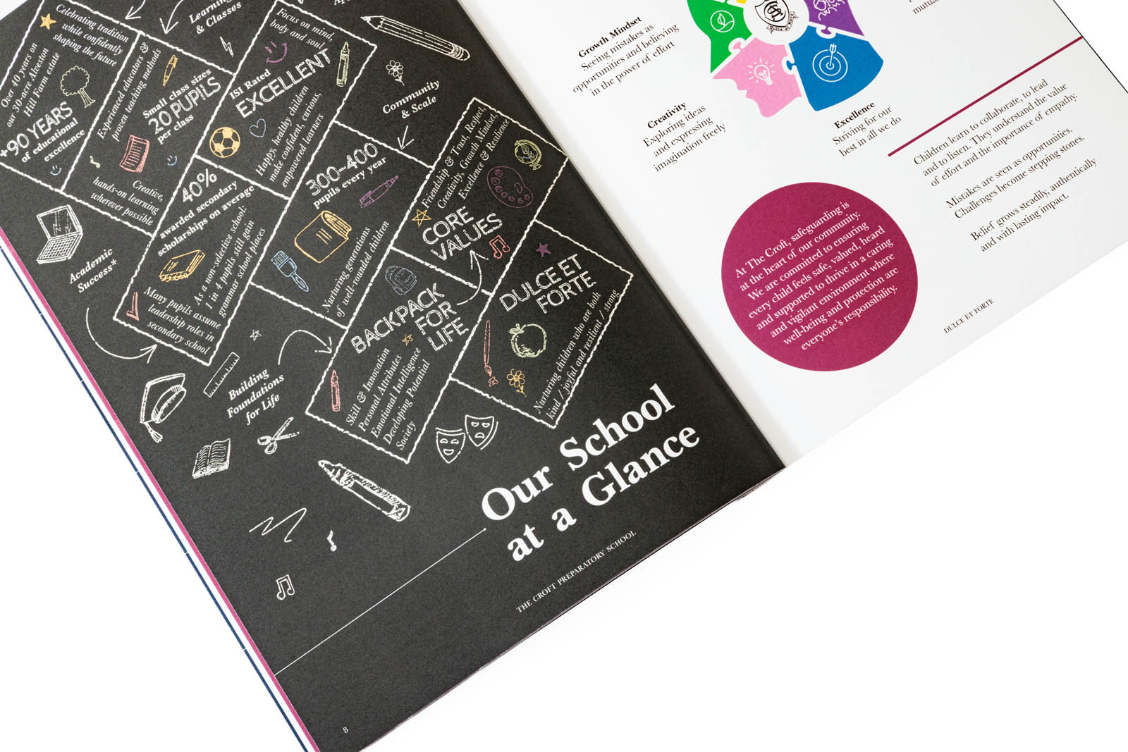
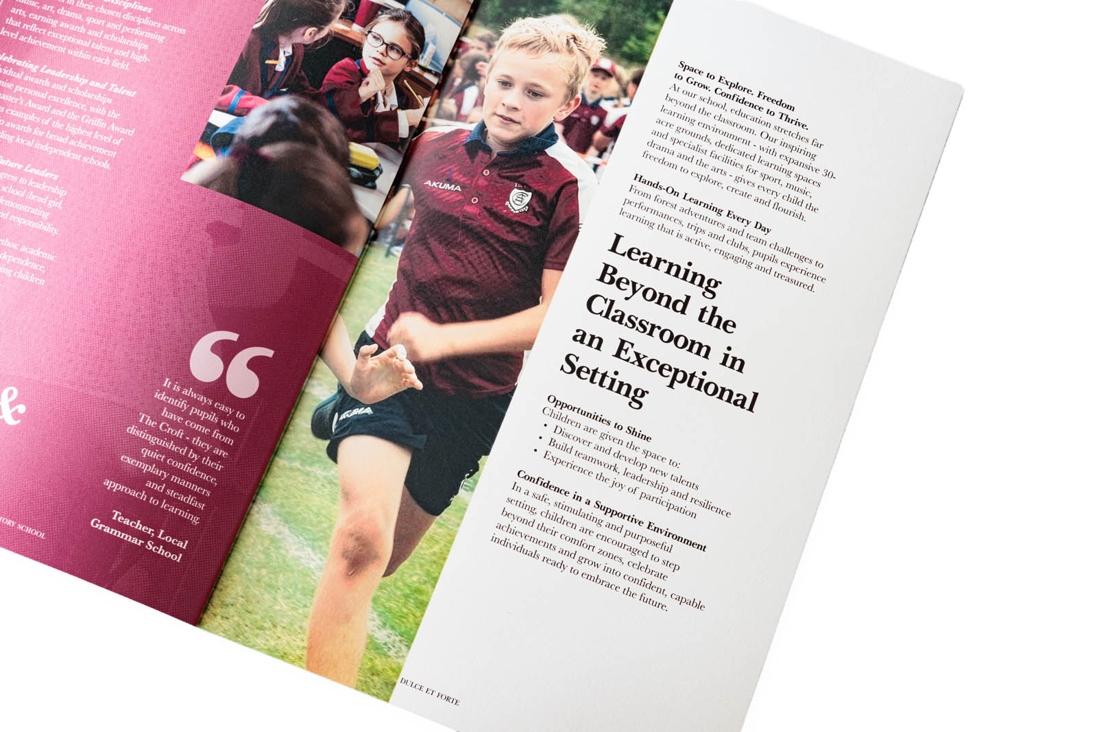
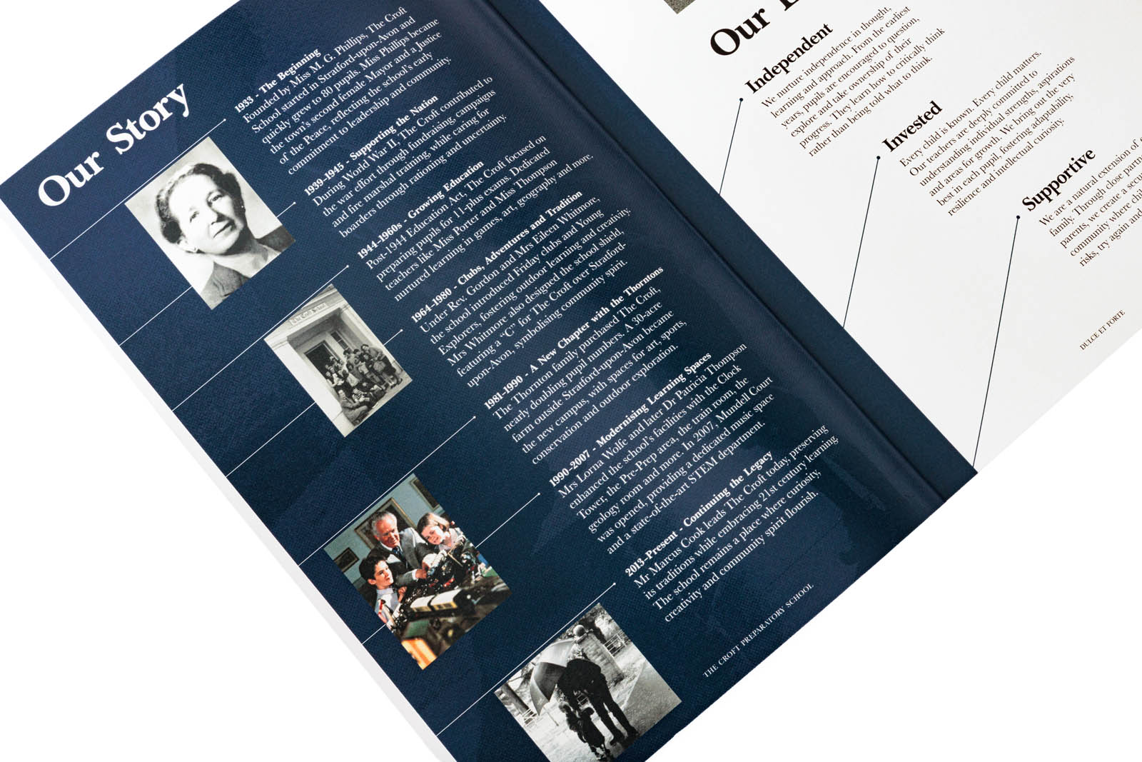
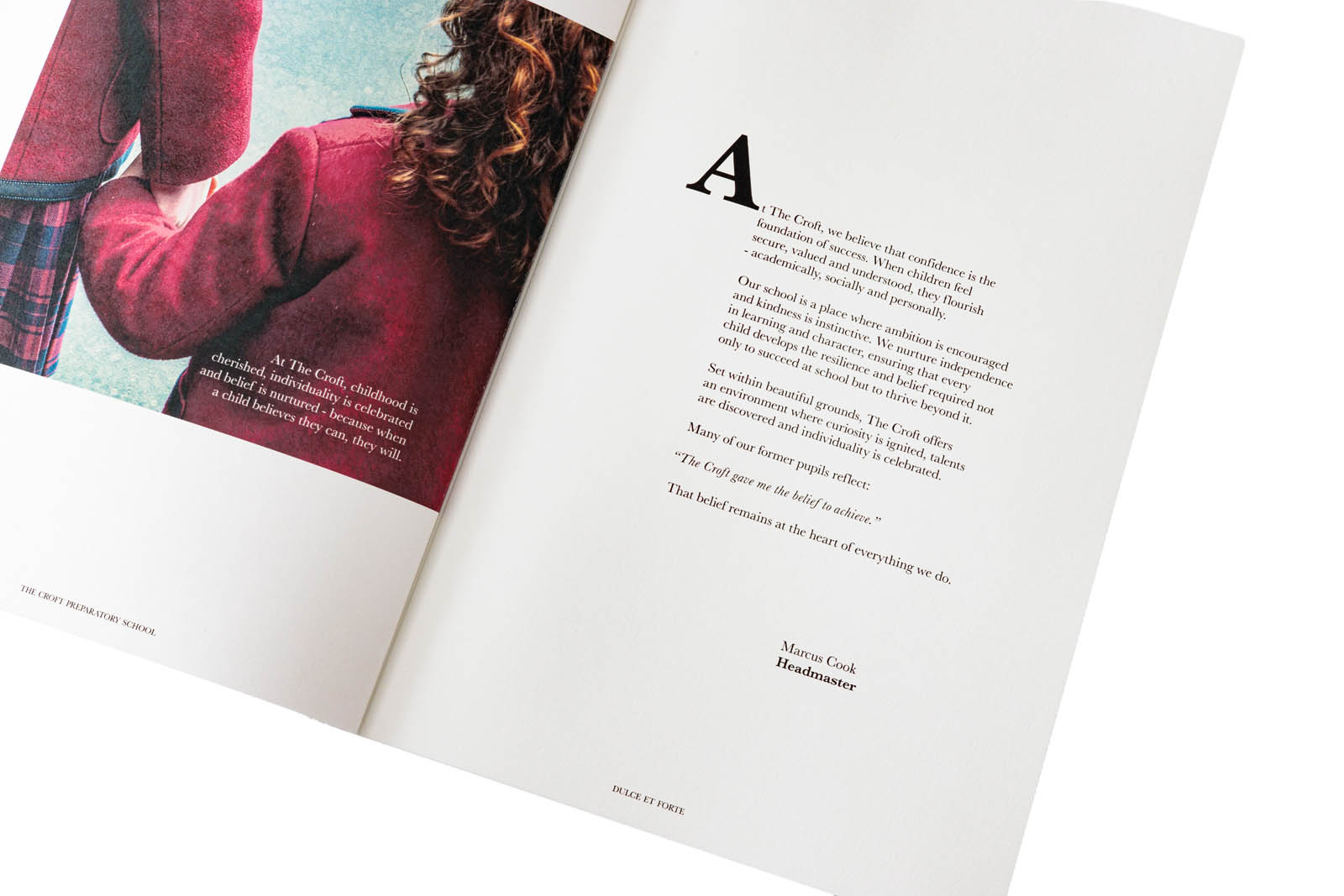
We were restricted on paper size so we opted to keep the dimensions at A4 format (210mm x 297mm) with a deep gutter for the fold and bind. We leant into this by creating a 9×9 grid based on the gutter depth.
A format like this offered more complexity, and needed extra care when it came to graphic design. Midlands based Think Print were on hand for frequent communication and updates to ensure paper, finish, and layout married up for a slick result.
As with previous projects with The Croft, we set body copy in classic Baskerville to emphasise the heritage of the school’s offer. This was offset by the chunky, halftone styling of the imagery throughout.
The halftone treatment brought a modern edge to the cards and prospectus, and – importantly – allowed us to make good use of photos that struggled in full colour, full size print format due to pixelation.
Together, the cards and prospectus are part of the ongoing development of The Croft’s visual identity. A process that is set to continue over the course of the next school year.
Need support on brand identity or graphic design? Midlands or anywhere-else-based? We are always open to new opportunities, so please get in touch.